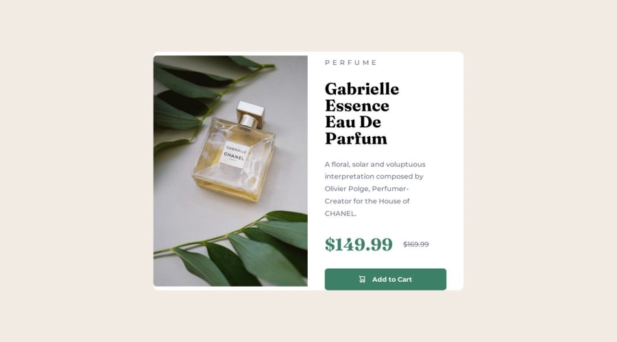
Design comparison
Solution retrospective
had a bit of trouble when handling the image's width to stretch it so it will fit the overall card's length. any suggestions on how to be more effective at image resizing?
Community feedback
- @ratul0407Posted 11 months ago
Hey there @vintech05, congrats on completing this challenge🎉🎉
for the image you can do the following
//this will make working with images a lot easier img { display: block; max-width: 100%; } .product_card-image { width: 360px; border-radius: 0.5em 0 0 0.5em; //you don't need the height and overflow properties anymore🙂 }
I hope this helps🙂🙂
Happy coding brother🎉🎉
Marked as helpful0 - @Call4juliusPosted 11 months ago
Images can be tricky to work with.
What I now understand is that you will need to change the "FORMATTING CONTEXT". I don't know if you have heard of that phrase before?
To do that just give the img {display: inline-flex or flex}
This works because the default behavior of flex items is stretch. So the image will stretch to fit the container.
0 - Account deleted
Hey, you cah just take the parent div as reference and put same height of the image based on parent div element. You can checkout my solution
0 - @danielmrz-devPosted 11 months ago
Hello @vintech05!
Your project looks good!
I couldn't take a look at your code. The link to your github is not working for some reason.
About image resizinng, have you tried using the image as a section background? It is a very good way to work with images.
I hope it helps!
Other than that, good job!
0
Please log in to post a comment
Log in with GitHubJoin our Discord community
Join thousands of Frontend Mentor community members taking the challenges, sharing resources, helping each other, and chatting about all things front-end!
Join our Discord