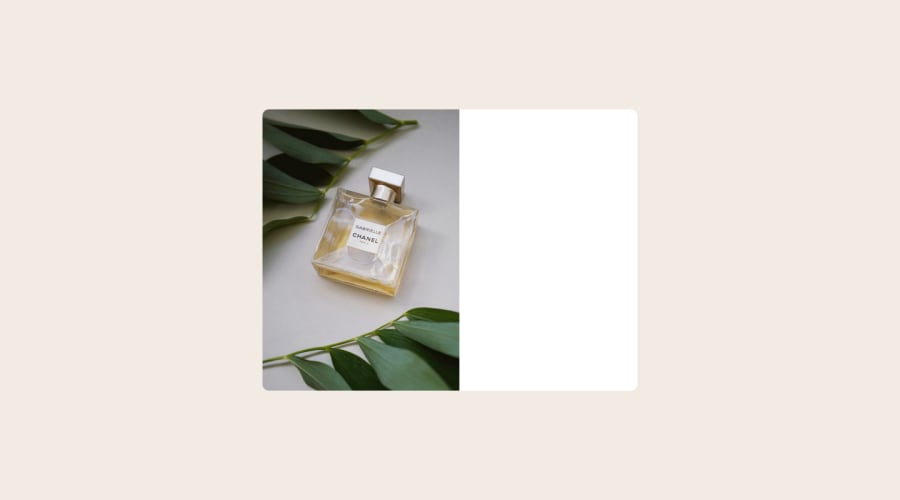
Design comparison
Solution retrospective
Hello, everyone! Just completed Product-preview-card-component challenge.
The project was very interesting.
- Had some difficulties with centering the container.
- Stuck while making the mobile design.
Let me know if i can Improve this.
Any feedback's and suggestions will be appreciated. Thanks.
Community feedback
- @0xabdulkhaliqPosted over 1 year ago
Hello there 👋. Good job on completing the challenge !
- I have some suggestions about your code that might interest you.
- Looks like you want to be familiar with css layouts before you diving into building projects.
- So you can try out the following useful resources for
flexlayout &gridlayout
RESOURCES:
- For
GridTry out this article about "css grid resources collection" - Play with grid cheatsheet
- For
fexboxyou can checkout this article from csstricks
I hope you find it useful! 😄 Above all, the solution you submitted is great!
Happy coding!
Marked as helpful1 - @tuliovini13Posted over 1 year ago
Good project. But you should make your "image-box" 50% width and your ""produt-deatils" 50% width too, to align perfect 50% width each other. It is also not recommended to use 100vh for <body> height as it does not display properly on some mobile browsers, use max-height: 100%.
Marked as helpful1@ankitwawarePosted over 1 year ago@tuliovini13 Thanks For sugesition , i will implement it .
0
Please log in to post a comment
Log in with GitHubJoin our Discord community
Join thousands of Frontend Mentor community members taking the challenges, sharing resources, helping each other, and chatting about all things front-end!
Join our Discord
