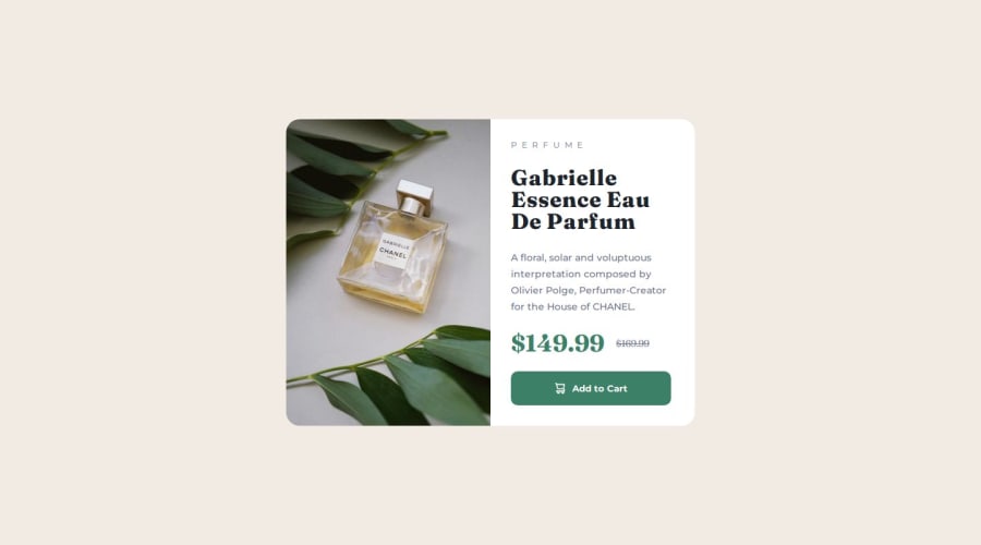
Design comparison
SolutionDesign
Solution retrospective
What are you most proud of, and what would you do differently next time?
i'm pleased with this work, since i was on vacation and didn't study IT, and i easily and quickly remembered the display grid
What challenges did you encounter, and how did you overcome them?basically no, since i did something similar to this
What specific areas of your project would you like help with?none
Community feedback
Please log in to post a comment
Log in with GitHubJoin our Discord community
Join thousands of Frontend Mentor community members taking the challenges, sharing resources, helping each other, and chatting about all things front-end!
Join our Discord
