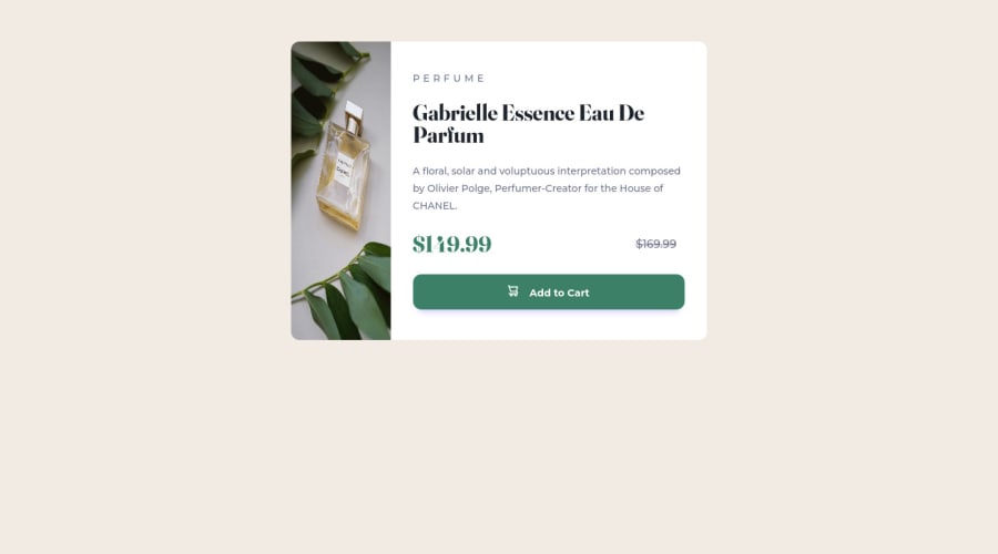
Design comparison
Community feedback
- @Luis-OliveroPosted about 2 years ago
Hello Kalani Prabodha, congratulations on completing this challenge! Looking at the report it seems you have a few accessibility issues and only one issue with your HTML.
For the HTML issue, I would replace your <strike> tag with a <span> tag instead. You can still get the strike through effect with your CSS.
.prev{
    margin-right: 12px;
    text-decoration: line-through;
}
I would also recommend adding a <main> tag around your div.card for better accessibility.
<body>
  <main>
    <div class="card">
    </div>
  </main>
</body>
Another accessibility issue you have is that you need at least one <h1> tag on your page. You can either replace your <h2> with an <h1> and your <h3> with an <h2>.
<h2 class="title-type">PERFUME</h2>
<h1 class="title-preview"> Gabrielle Essence Eau De Parfum</h1>
Or you can you add an <h1> that will be hidden by adding a class of sr-only.
<h1 class="sr-only"></h1>Hope this helps and keep at it!
Marked as helpful1
Please log in to post a comment
Log in with GitHubJoin our Discord community
Join thousands of Frontend Mentor community members taking the challenges, sharing resources, helping each other, and chatting about all things front-end!
Join our Discord
