Design comparison
Community feedback
- @Rajesh7rjPosted over 1 year ago
Hello @leiftocd, Great work buddy.
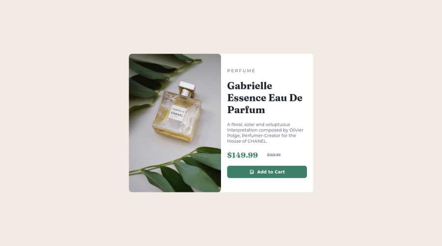
I want to you give advice about your image border radius. your border-radius is 10 px. But we only have to give border-radius to only top left of the image and bottom left of the image.
So you can add these two line of code for correction.
this is your code should be in your style.css 👇 img{ border-radius : 10px; border-top-right-radius: 0; border-bottom-right-radius: 0; }
or
img{
border-top-left-radius: 10px; border-bottom-left-radius: 10px; }
I wish you the best, hope my feedback will help you. Keep learning buddy...
Thanks Rajesh Janyai
Marked as helpful0 - @HassiaiPosted over 1 year ago
Give the alt attribute in the img a value. The value of the alt attribute is the description of the image. For decorative images like icons, there is no need to give it an alt value, for more on alt attribute Click here.
For a responsive image us the picture tag. For more click here
To center .card on the page using flexbox, replace the height in the body with min-height: 100vh.
Use relative units like rem or em as unit for the padding, margin, width values and preferably rem for the font-size values, instead of using px which is an absolute unit. For more on CSS units Click here
Hope am helpful.
Well done for completing this challenge. HAPPY CODING
Marked as helpful0
Please log in to post a comment
Log in with GitHubJoin our Discord community
Join thousands of Frontend Mentor community members taking the challenges, sharing resources, helping each other, and chatting about all things front-end!
Join our Discord
