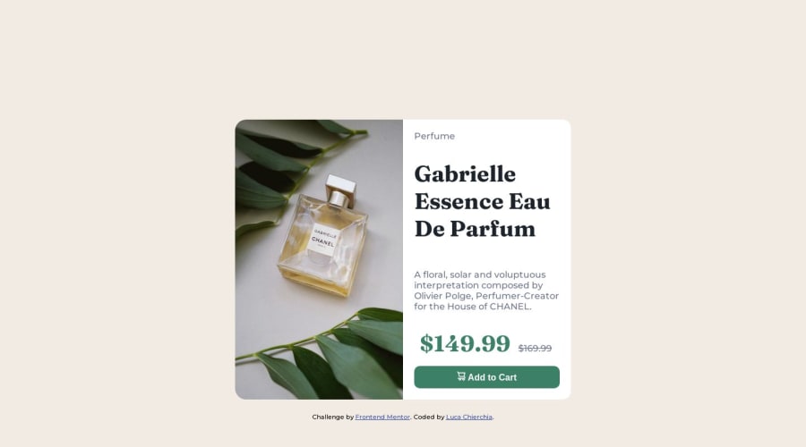


Design comparison

Solution retrospective
Hi everyone. I'd like to receive constructive criticism on the code and know if I used wrong properties and more... Many thanks to all <3
Community feedback
- @0xabdulkhaliqPosted over 1 year ago
Hello there 👋. Congratulations on successfully completing the challenge! 🎉
- I have other recommendations regarding your code that I believe will be of great interest to you.
PiCTURE TAG 📸:
- Looks like you're currently using single image for both Desktop & Mobile devices, but we want to swap images according to their screen sizes. Luckily there's a native html element which may help us to achieve this method without need of css
- So let me introduce the
pictureelement.
- The
<picture>tag is commonly used for responsive images, where different image sources are provided for different screen sizes and devices, and for art direction, where different images are used for different contexts or layouts.
- Example:
<picture>
<source media="(max-width: 768px)" srcset="small-image.jpg">
<source media="(min-width: 769px)" srcset="large-image.jpg">
<img src="fallback-image.jpg" alt="Example image">
</picture>
- In this example, the
<picture>tag contains three child elements: two<source>elements and an<img>element. The<source>elements specifies different image sources and the conditions under which they should be used.
- Using this approach allows you to provide different images for different screen sizes without relying on CSS, and it also helps to improve page load times by reducing the size of the images that are served to the user
- If you have any questions or need further clarification, you can always check out
my submissionand/or feel free to reach out to me.
.
I hope you find this helpful 😄 Above all, the solution you submitted is great !
Happy coding!
Marked as helpful0@ElleCh9Posted over 1 year ago@0xAbdulKhalid Hi Abdul, You were really great in explaining how to use different images based on screen size. Thanks to your advice, I present the improved solution again. ^^
0 - @rohitd99Posted over 1 year ago
Hi ElleCh9
Congrats on completing the challenge.
A few suggestions I hope can help you,
- Add the following properties on
body
min-height: 100vh;
display: grid;
place-content: center;
these will help keep the content centered and also on mobile view the content may expand more than the screen size. Remove the margins on the container for the desktop view.
- I noticed you have used
h2for the title of perfume , use anh1instead since each page needs ah1and you can style it as per need. Also headings always need to be fromh1throughh6in sequence according to semantics. - You also have changed the
gridtoflexfor mobile view, you can actually achieve the same without changing thegridbut instead only addinggrid-template-columns: auto;instead. - You also need to change the border-radius of description-article in the mobile view, to
border-radius: 0 0px 15px 15px; - Use the
delelement for the old price, it provides more meaning and default strikethrough style.
Hope it helps
Marked as helpful0@ElleCh9Posted over 1 year ago@rohitd99 Wow!! I will make the suggested changes to see the result. Thanks for the advices.
0 - Add the following properties on


Please log in to post a comment
Log in with GitHub
Join our Discord community
Join thousands of Frontend Mentor community members taking the challenges, sharing resources, helping each other, and chatting about all things front-end!
Join our Discord