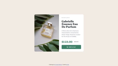
Submitted over 1 year agoA solution to the Product preview card component challenge
Product-preview-card-component

@Fafell
Solution retrospective
What are you most proud of, and what would you do differently next time?
I managed to complete the task and it looks great to me, I learned a lot about responsiveness
What challenges did you encounter, and how did you overcome them?IMG styling
What specific areas of your project would you like help with?any help and feedback will be useful
Code
Loading...
Please log in to post a comment
Log in with GitHubCommunity feedback
No feedback yet. Be the first to give feedback on Fafel's solution.
Join our Discord community
Join thousands of Frontend Mentor community members taking the challenges, sharing resources, helping each other, and chatting about all things front-end!
Join our Discord