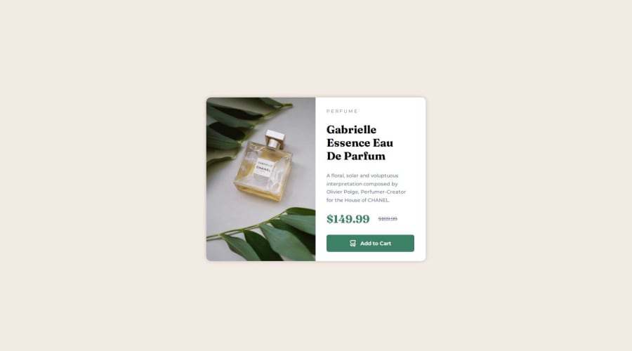
Design comparison
SolutionDesign
Solution retrospective
What are you most proud of, and what would you do differently next time?
I was able to code this out pretty quickly, from what i understand anyway.
What challenges did you encounter, and how did you overcome them?Trying to get the button set up properly. I ended up using negative margin, im going to try and learn more to see how to do that properly. i did mis-label things at the beginning, after i was done doing the css i realized this, so i made small changes, which meant i had to alter some. but end of the day, i made it work.
Community feedback
Please log in to post a comment
Log in with GitHubJoin our Discord community
Join thousands of Frontend Mentor community members taking the challenges, sharing resources, helping each other, and chatting about all things front-end!
Join our Discord
