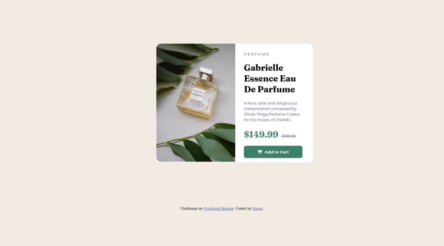
Design comparison
Solution retrospective
This is my second project.
Feel free to give any kind of feedback.
Thank You!
Community feedback
- @correlucasPosted about 2 years ago
👾Hello Sagar, Congratulations on completing this challenge!
Your solution its almost done and I’ve some tips to help you to improve it:
A better way to work this solution image, the product image is by using
<picture>to wrap it on the html instead of using it as<img>orbackground-image(with the css). Using<picture>you wrap both images (desktop and mobile) and have more control over it, since you can set in the html when the images changes setting the screen size for each image.ote that for SEO / search engine reasons isn’t a better practice import this product image with CSS since this will make it harder to the image.Here’s the documentation and the guide to use this tag:
https://www.w3schools.com/tags/tag_picture.aspSee the example below:
<picture> <source media="(max-width:650px)" srcset="./images/image-product-mobile.jpg"> <img src="./images/image-product-desktop.jpg" alt="Gabrielle Parfum" style="width:auto;"> </picture>👨💻Here's my solution for this challenge if you wants to see how I build it: https://www.frontendmentor.io/solutions/product-preview-card-vanilla-css-and-custom-hover-state-on-hero-85A1JsueD1
✌️ I hope this helps you and happy coding!
Marked as helpful1 - @samantha-lindPosted about 2 years ago
Hi Sagar
I noticed you hardcoded the style for the "Perfume" header in your HTML ->
<p class = "Head">P E R F U M E</p>You can achieve the same effect by adding these two styles to your "head" class in CSS:
text-transform: uppercase; (this will display any text in uppercase only)
letter-spacing: 3px; (this will space out each of the letters - you can use any type of size here (px or em, for example)
If you have these two styles on in CSS, you can simply write <p class="head">perfume</p> and you'll achieve the same result.
I hope that helps! Samantha
Marked as helpful1 - @Raja-JunaidPosted about 2 years ago
Hi Sagar! Congratulations on completing this challenge. I really like your solution and it's very nice. I want to share some tips and tricks that may improve your coding skills:
1- Use comments in your code so this help what's going on.
2- Make your work as decent as possible.
3- Make a neat and clean website.
I hope this helps you
Marked as helpful1
Please log in to post a comment
Log in with GitHubJoin our Discord community
Join thousands of Frontend Mentor community members taking the challenges, sharing resources, helping each other, and chatting about all things front-end!
Join our Discord
