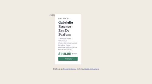
Submitted over 3 years agoA solution to the Product preview card component challenge
Product-preview-card
@dripping-code

Solution retrospective
I hope i did it to my full potential.. Please if there is any issue i can correct can you direct me.
Code
Loading...
Please log in to post a comment
Log in with GitHubCommunity feedback
No feedback yet. Be the first to give feedback on Kelvin's solution.
Join our Discord community
Join thousands of Frontend Mentor community members taking the challenges, sharing resources, helping each other, and chatting about all things front-end!
Join our Discord