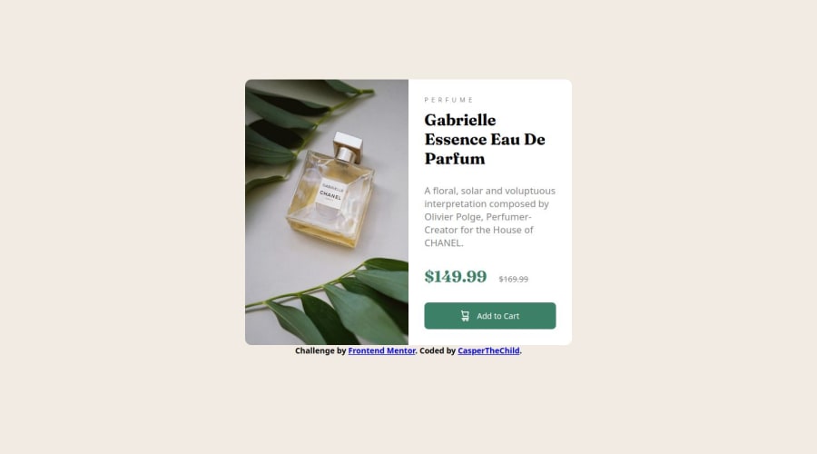
Design comparison
Solution retrospective
Srcset
What challenges did you encounter, and how did you overcome them?I haven't faced any problems except one, which I couldn't solve.
What specific areas of your project would you like help with?I couldn't figure out why the 'srcset' and 'sizes' attributes in '' aren't working. I tried everything, but it still didn't work as I planned. Could you look at my code and provide feedback?
Community feedback
- @KapteynUniversePosted 14 days ago
I think the problem is you didn't use the real width of the images. A mismatch here may prevent browsers from selecting the correct image. Try this one:
<img src="images/image-product-desktop.jpg" srcset="images/image-product-mobile.jpg 686w, images/image-product-desktop.jpg 600w" sizes="(max-width: 600px) 100vw, (min-width: 601px) 100vw" alt="the product">
But using picture tag would be better tho.
<picture> <source media="(min-width:600px)" srcset="./images/image-product-desktop.jpg" /> <img src="./images/image-product-mobile.jpg" alt="Perfume image" /> </picture>
For better responsiveness avoid using hard coded values like
width: 576px;
usemax-width: 576px;
instead.Use a modern css reset for every project.
Marked as helpful1 - @khatri2002Posted 14 days ago
The design seems good. However, there are few enhancements which can be done in order to achieve cleaner code and more accurate design.
You've used 'p' tag to render the prices, however, a 'span' tag seems more relevant since we only wish to render a single word. Also, the strikethrough price text should be aligned center vertically.
The height of image appears to be higher in the mobile view, resulting in scroll behaviour of webpage.
Happy Coding!
Marked as helpful0
Please log in to post a comment
Log in with GitHubJoin our Discord community
Join thousands of Frontend Mentor community members taking the challenges, sharing resources, helping each other, and chatting about all things front-end!
Join our Discord