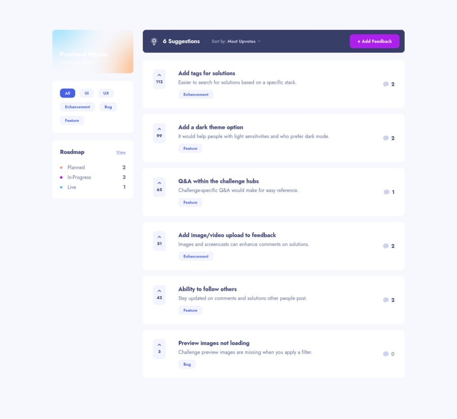
Design comparison
Solution retrospective
Hi,
Feedback are weelcome !
I saw my SVG backgrounds broke, i'll fix it :)
🤘
Community feedback
- @pikapikamartPosted over 3 years ago
Hey, awesome work on this one. Desktop layout looks great but the title on the left side is not visible since the color blends into the background-color, changing the gradient's color would be really great. Site is responsive and mobile state looks great.
Don't know if I could review full, but here are some:
maindoes not need arole="main"since it is already themaintag.- Those clickable items on the sidebar should have use
buttoninstead ofdiv. Interactive components needs to use interactive elements, by usingdivyou are excluding lots of user to the functionality. Right now, only mouse can interact with it and not other peripherals. - It would be great as well to have an
aria-livestating what happened when the user toggles something, this way they will be notified right after toggling it. - Also, there are lots of usage of
sectiontags in here which you don't really need, sincesectionneeds to be labelled by another text or heading. You can usedivfor others. - On the roadmap, those 3 items below it could have use
ulsince they are a "list" of items for the user. - Svg's like the lightbulb on the left side of the suggestions, the comment bubble, the plus sign when clicking the add-feedback, the arrow-up on the upvotes, those should be hidden so use
aria-hidden="true"for thosesvg's. - The sorting should be using an interactive element like a
selector a custom-listbox but not certainly aptag like on this one. - The selections inside the sort-dropdown is not accessible as well.
- Those upvotes should be using a
buttonsince when a user clicks on that, the value would be then incremented. - You could use
ulas well for those different suggestions since it makes sense since they are "list" of suggestions. - Also, I wouldn't use
atag to be a parent for those items inside each suggestions and making it a grid. Instead a better markup would be to have the bold text to be a heading tag withatag inside:
<h3>
  <a> add tags for solution </a>
</h3>
The whole
lithat wraps each of the suggestion would beposition: relativeand theatag's pseudo, eitherbeforeoraftershould haveheight: 100%width: 100%to make the whole item clickable. This way, the markup is proper but remember to make the upvoteposition; relativewithz-index.ADDING FEEDBACK
Go Backshould havehrefso that it will work properly. Anatag that does not havehrefwill not function the way it should.- Also when using keyboard to target the add-feedback, after going into the next site, when you use the
tabon the keyboard again, the focus is nowhere to be found. it would be great for you have have like a function that.focus()on thebodytag so that when transitioning to another page, the user will still be able to navigate properly the site. - You should have used
formon this one since those are input fields that submits data. - Also, since it is another page, remember that
h1should be present at least once in a page. - Those
feedback titlecategorycould have been alabelfor theinputbelow them. - Each
inputlacksidthat could be referenced by alabel. - Right now, the error is only available visually but it is not being reflected to the
inputitself. A proper way of doing it would look like this:
if ( input is wrong )
  input.setAttribute("aria-invalid", "true");
  input.setAttribute("aria-describedBy", id of the error-message);
else
  input.removeAttribute("aria-invalid");
  input.removeAttribute("aria-describedBy");
The error-message element should have an id attribute which is referenced by the aria-describedBy attribute on the input element. By doing that, your user will know that the input is wrong because of aria-invalid and they will know what kind of error they made because of the aria-describedBy.
- It would be great as well to have an
aria-livethat will state if theformsubmitted is successful or if there are errors on it. This way, users will be informed right away about the status of theformsubmission. - The
cancelshould be a link since making it abuttonit should not redirect a user to a page right. - The "add feedback" on the other hand should have
type="submit". Remember that when abuttonis placed inside aformelement, it defaults totype="submit". So imagine if you have a close-button inside theformwithout specifyingtype="button"click the close-button will submit theform. Be aware of this kind of scenarios.
I won't go into each of the suggestions since it is the same with the
add feedback.MOBILE
- Hamburger menu should be using a
buttonsince it is an interactive component.
SUPPOSING BUTTON IS USED
- The
buttonshould have a default atribute ofaria-expanded="false"and it will be set totruewhen the users toggles it and vice-versa. - The button should have either
aria-labelattribute orsr-onlytext inside it which defines what thebuttondoes.
Aside from those, great job again on this one.
Marked as helpful1@DavidMaillardPosted over 3 years ago@pikamart Woaw what a feedback. Thank you very much, I will read this with extreme attention.
aria-label is not a thing that I am good at, you will increase my skills. Thx !!
1
Please log in to post a comment
Log in with GitHubJoin our Discord community
Join thousands of Frontend Mentor community members taking the challenges, sharing resources, helping each other, and chatting about all things front-end!
Join our Discord
