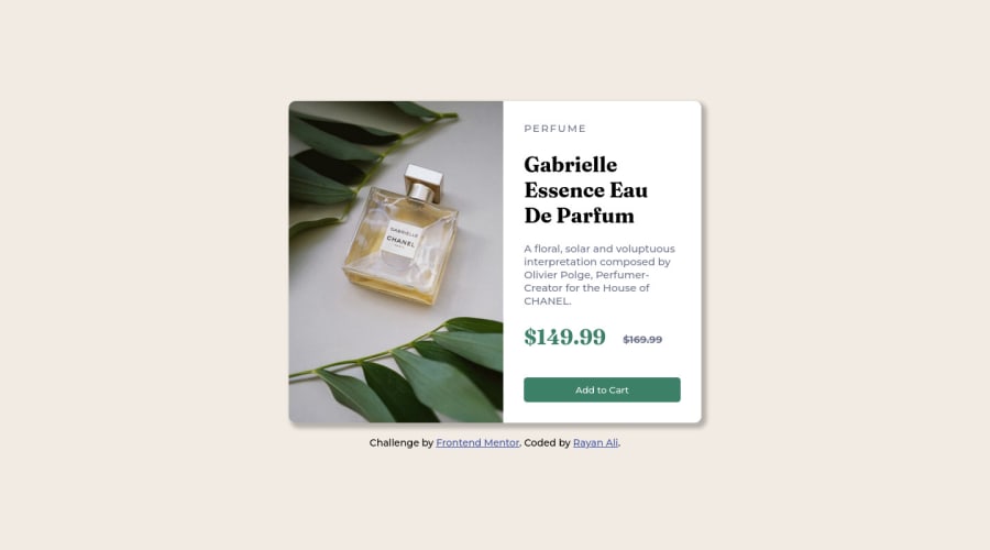
Design comparison
SolutionDesign
Community feedback
- @MelvinAguilarPosted almost 2 years ago
Hello there 👋. Good job on completing the challenge !
I have some suggestions about your code that might interest you.
HTML 📄:
- Wrap the page's whole main content in the
<main>tag.
- Use the
<footer>tag to wrap the footer of the page instead of the<div class="attribution">. The<footer>element contains information about the author of the page, the copyright, and other legal information.
- The <br> tag is often used to create line breaks, but it doesn't convey any semantic meaning. When a screen-reader reads the text, it will break the flow of reading at the line break tag, which can be confusing for users. More information here.
- The
altattribute is used to provide a text description of the image which is useful for screen reader users, assistive technology users, and search engine optimization. Add thealtattribute to the<img>tag of the product.
- You can use the
<picture>tag when you have different versions of the same image 🖼. Using the<picture>tag will help you to load the correct image for the user's device saving bandwidth and improving performance. You can read more about this here 📘.
CSS 🎨:
- Instead of using pixels in font-size, use relative units like
emorrem. The font-size in absolute units like pixels does not scale with the user's browser settings. You can read more about this here 📘.
- Use
min-height: 100vhinstead ofheight: 100vh. Theheightproperty will not work if the content of the page grows beyond the height of the viewport.
I hope you find it useful! 😄 Above all, the solution you submitted is great!
Happy coding!
Marked as helpful1 - Wrap the page's whole main content in the
Please log in to post a comment
Log in with GitHubJoin our Discord community
Join thousands of Frontend Mentor community members taking the challenges, sharing resources, helping each other, and chatting about all things front-end!
Join our Discord
