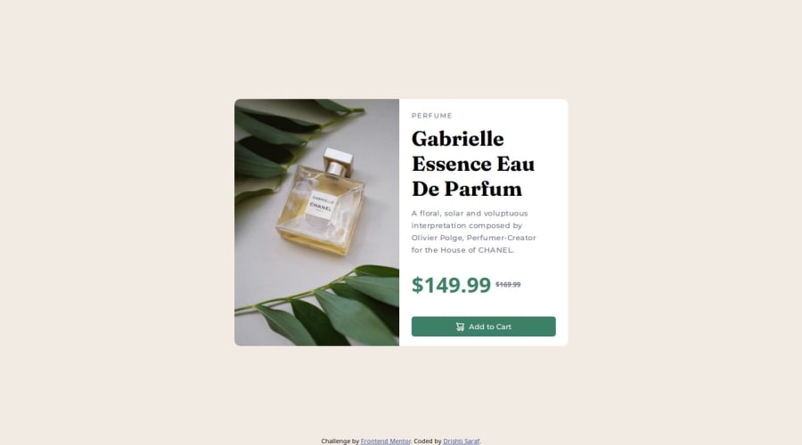
Design comparison
Community feedback
- @bhuvi819381Posted 3 months ago
Hello,
I just reviewed your solution, and it was awesome! Great work!
Here are a few suggestions to improve it further:
-
Update the README template
Use the template file provided to maintain consistency and clarity. -
Optimize font imports
Instead of using two separate links for fonts, combine them into a single file for better organization and performance. -
Remove unnecessary code (Lines 7 to 27)
This section doesn’t seem essential. Simplifying it will make your code cleaner and easier to maintain. -
Avoid using
pxfor units
Relative units likeemorremare more flexible and responsive. -
Reconsider absolute positioning (Line 119)
Usingabsolutepositioning too often can break responsiveness. I suggest avoiding it unless absolutely necessary.
These adjustments will help improve your project further while keeping it clean and responsive. Keep up the great work!
Marked as helpful1 -
Please log in to post a comment
Log in with GitHubJoin our Discord community
Join thousands of Frontend Mentor community members taking the challenges, sharing resources, helping each other, and chatting about all things front-end!
Join our Discord
