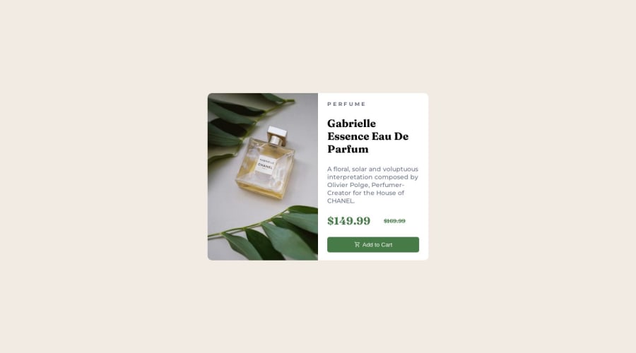
Design comparison
Please log in to post a comment
Log in with GitHubCommunity feedback
- @CodeWithAlamin
Hi Ana Gonçalves 👋 Great job on completing this challenge! 🥳 Your layout looks great.
Here are a few suggestions to further improve your code:
-
Consider using more specific CSS selectors to avoid potential conflicts with other elements on the page. For example, instead of
.card__leftSide .card__image, you could use.card__image--leftand.card__image--right, or simply.card__image--leftand.card__image--right. -
Consider using CSS variables to define and manage colors, fonts, and other common styles. This will help ensure consistency across your site and make it easier to make changes later on
-
Make sure to follow consistent naming conventions for your classes and IDs. For example, in your
mainelement you have a.cardclass, but outside ofmainyou also have a.cardclass. This could lead to confusion or unexpected behavior in your CSS. Consider using more descriptive names like.product-cardor.pricing-cardinstead.
Hope I'm Helpful! 👍
Keep up the good work and happy coding!! 😊❤️
-
Join our Discord community
Join thousands of Frontend Mentor community members taking the challenges, sharing resources, helping each other, and chatting about all things front-end!
Join our Discord
