Product Review using picture element + flexbox

Solution retrospective
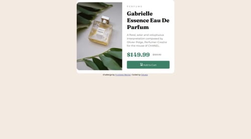
Focusing on the HTML for the first time made the process extremely easy to tackle, to where the mobile is flawless and I barely had to make edits to make the desktop version work. I still had issues, of course, and it isn't perfect, but I am definitely proud of how streamlined the process was. I will definitely do this again the future.
What challenges did you encounter, and how did you overcome them?Messing around with the prices to make them spaced properly in both versions was difficult, but messing around with rem size for the overall width made it alright and responsive in all different sizes I believe.
What specific areas of your project would you like help with?I need help with the Desktop version of the image, cause it squishes at the top and bottom and I didn't know how to fix that.
Please log in to post a comment
Log in with GitHubCommunity feedback
No feedback yet. Be the first to give feedback on oduwa-A's solution.
Join our Discord community
Join thousands of Frontend Mentor community members taking the challenges, sharing resources, helping each other, and chatting about all things front-end!
Join our Discord