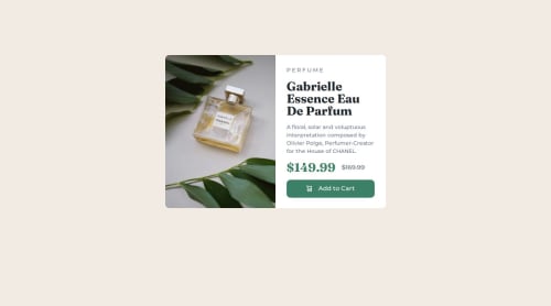
Not Found
Not Found
Not Found
Not Found
Not Found
Not Found
Not Found
Not Found
Not Found
Not Found
Not Found
Not Found
Not Found
Not Found
Not Found
Not Found
Not Found
Not Found
Not Found
Not Found

Submitted

Product Review Solution

vknir 60

@vknir

Desktop design screenshot for the Product preview card component coding challenge

This is a solution for...

  • HTML
  • CSS
1newbie
View challenge

Design comparison


SolutionDesign

Solution retrospective


What are you most proud of, and what would you do differently next time?

Out of all projects that I have made on Front End Mentor, this one has the cleanest code.

One thing that I would do differently is to increase the use of media queries to improve the responsiveness of my projects.

What challenges did you encounter, and how did you overcome them?

  • Getting familiar with Grids in CSS was not as easy as expected. Luckily with the help of CSS Garden I was able to better understand grids.

-Also, switching between image sources depending upon size of the screen was a new thing for me. This article was the exact solution to my problem.

What specific areas of your project would you like help with?

  • Some tips to improve responsiveness of projects.

Community feedback

@TedJenkler

Posted

Hi @vknir,

Nice project! Here are a few additional suggestions:

Centering a Div: Another way to center a div is by using position: relative on the parent and position: absolute on the child. Then, set top: 50%, left: 50%, and use transform: translate(-50%, -50%) to center it. While this method may not be necessary for your current project, it's a useful technique, especially when you need to ensure the element remains centered while also being able to overlap other elements. (Added it purely for fun :)

Responsive Design: I noticed that your design doesn't seem fully responsive at a 1000px width in Chrome DevTools. I recommend checking your project at various breakpoints using DevTools before finalizing it. Consider avoiding fixed widths and instead use max-width and min-width for better responsiveness. Heights can often be managed/replaced with padding and margins, reducing the need for fixed heights. Additionally, consider using rem or em units instead of px for more flexible and scalable designs. Note that em units inherit from parent elements, so use them with caution if not sure of their effect.

Keep up the great work!

Best, Teodor

Marked as helpful

1

@SvitlanaSuslenkova

Posted

body { display: flex; flex-direction: column; justify-content: center; align-items: center; min-height: 100vh; } Try this to align(top-bottom) and justify(left-right) your project to the center. It applies to the parent component(body), don't forget abut min-height. You can use grid instead of flex too(with some changes). Hope you found this comment helpful :)

Marked as helpful

1

Please log in to post a comment

Log in with GitHub
Discord logo

Join our Discord community

Join thousands of Frontend Mentor community members taking the challenges, sharing resources, helping each other, and chatting about all things front-end!

Join our Discord