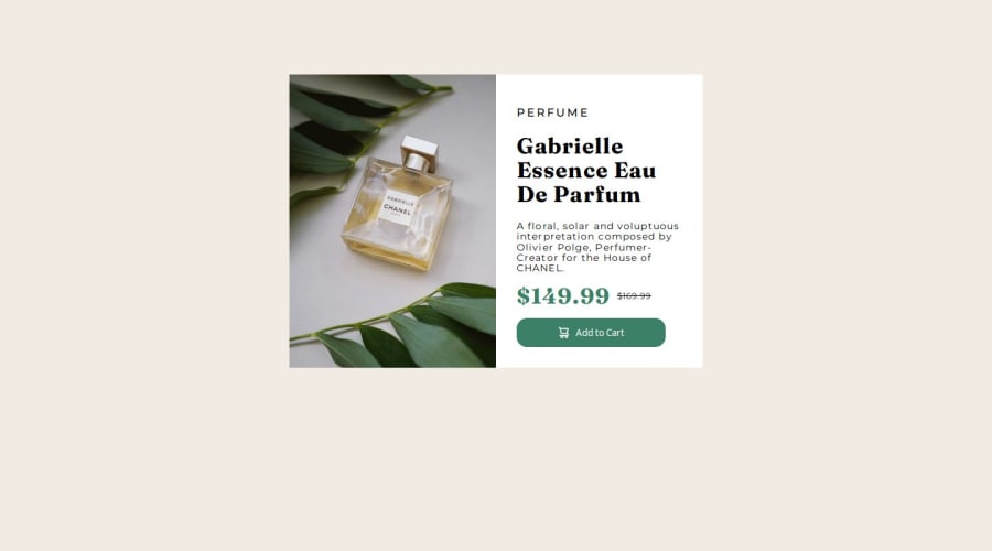
Design comparison
SolutionDesign
Solution retrospective
What are you most proud of, and what would you do differently next time?
Following feedback, I used flex on the body to centre the content rather than margin. I also used css to populate and change the images for the first time (so that's something new learned).
What challenges did you encounter, and how did you overcome them?This went pretty smoothly.
What specific areas of your project would you like help with?Any feedback on whether my approach to marking text is correct. I think I'm using headings too and should be using span instead.
Community feedback
Please log in to post a comment
Log in with GitHubJoin our Discord community
Join thousands of Frontend Mentor community members taking the challenges, sharing resources, helping each other, and chatting about all things front-end!
Join our Discord
