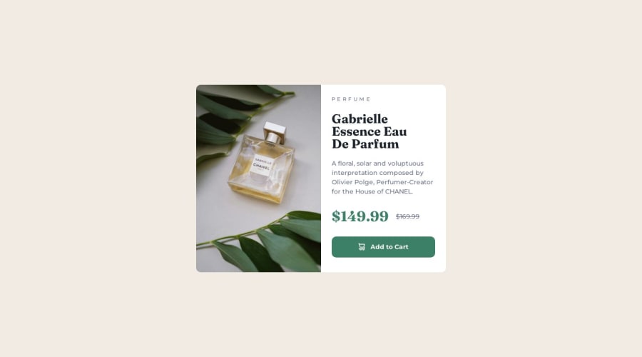
Product review card: flexbox, grid, figure, picture
Design comparison
Solution retrospective
- How to name color variables? primary, neutral, cornflower, blue, ...?
- When to use
%
? I userem/em
in most cases andpx
for margin/padding - I put everything in
figcaption
, is that right? Because I think all of the information is about the picture, so they are all caption. - Is there too much explicit width? including
max-width
andmax-height
- Better ways to write HTML & CSS: semantics, too many div?, class usage, CSS code refactoring
Any comments are welcomed! Thanks for reading this submission
Community feedback
- @adityaphasuPosted about 1 year ago
Hello!
To answer your questions:
- You can name the color variables according to the color names given in styleguide for example:
Dark cyan: hsl(158, 36%, 37%)
to like--dark-cyan: hsl(158, 36%, 37%)
etc. - Use
%
when you want the element to change according to the parent element's size.rem/em
are based on relative font sizes of root or parent element. A simple use case for%
would be something like using percentage widths for responsive containers or columns. - The
figcaption
is used to describe the image and in your solution you have also added thebutton
inside thefigcaption
, while it is technically allowed to place abutton
element inside afigcaption
, it might not be the best practice from a semantic and accessibility standpoint because it might confuse the users say for example the screen reader reads the caption of the image for perfume but it also reads the button and the user might think its just the description of the image and hence not interactive. So you might wanna separate the button from thefigcation
. - While the solution currently works with
max-height
andmax-width
, it can actually be simplified pretty much to just usingmax-width: 35rem
on the<main>
tag instead. This way you won't need to set amax-height
andmax-width
to the figure. (try playing around with the dev tools to stimulate the value) - Your solution actually is pretty good with minimal divs. A few suggestions to make it more semantic could be you can replace the
div
which contains the text inside the button with aspan
element instead. For the striked out price you can use a more semantic tag like<del>
which is used to strike a line through a text segment to indicate it has been deleted and also to indicate information that has been updated or is no longer accurate(here its the price). For more you can read about it here and also here! - To me, the CSS looks quite good though you might want to readjust a bit according to what I have specified earlier (for
main
tag).
It's quite nice to see a solution with almost a good semantic markup! Good job!ππ»
Keep up the hard work and happy coding!π
Marked as helpful1@devusexuPosted about 1 year ago@adityaphasu OMG you are so considerate! Never imagine that someone is willing to answer all my questions, not even to mention that you answer every question on point too!
I revised every part you suggested except for the naming of variables, I will absolutely try that in my other works.
Thank you so much for your patience and generosity, I wish you a ideal career and a wonderful life β€οΈ
1@adityaphasuPosted about 1 year ago@devusexu no problem! and good luck on your frontend journey too!βΊοΈ
1 - You can name the color variables according to the color names given in styleguide for example:
Please log in to post a comment
Log in with GitHubJoin our Discord community
Join thousands of Frontend Mentor community members taking the challenges, sharing resources, helping each other, and chatting about all things front-end!
Join our Discord