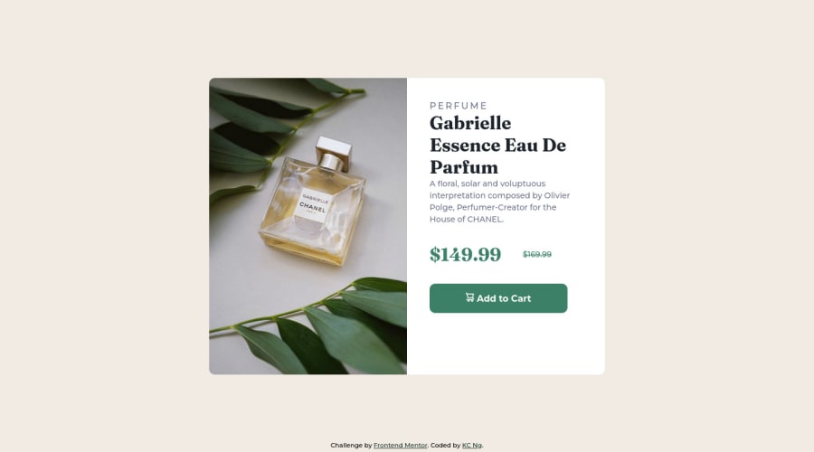


Design comparison

Community feedback
- @correlucasPosted about 2 years ago
👾Hello KC, Congratulations on completing this challenge!
Your solution its almost done and I’ve some tips to help you to improve it:
1.I saw that you’ve used
flexboxto place the content and create the layout.I think the best way to build this component with two columns is by using
GRID LAYOUTsince it is simpler to manage the columns and then create the media query for mobile. Here’s the steps to create it withgridcreate the main block to hold all the content (you can use<main>to wrap), set itswidthasmax-width: 900px(it's the container size) anddisplay: grid/grid-template-column: 1fr 1fr(this means that your component will have two columns with 50% of the container width each thats 450px). To manage the column with the text use flexbox andgapto give it the spacing between the texts or usepadding-bottomto separate them.Then to create the mobile version, all you need to do is to change the container flow vertically with
grid-template-column: 1fr.2.Use the THE PICTURE TAG that is a shortcut to deal with the multiple images in this challenge. So you can use the
<picture>tag instead of importing this as an<img>or using a div withbackground-image. Use it to place the images and make the change between mobile and desktop, instead of using adivorimgand set the change in the css withdisplay: nonewith the tag picture is more practical and easy. Note that for SEO / search engine reasons isn’t a better practice import this product image with CSS since this will make it harder to the image. Manage both images inside the<picture>tag and use the html to code to set when the images should change setting the devicemax-widthdepending of the device desktop + mobile.Check the link for the official documentation for
<picture>in W3 SCHOOLS:https://www.w3schools.com/tags/tag_picture.aspSee the example below:
<picture> <source media="(max-width:650px)" srcset="./images/image-product-mobile.jpg"> <img src="./images/image-product-desktop.jpg" alt="Gabrielle Parfum" style="width:auto;"> </picture>👨💻Here's my solution for this challenge if you wants to see how I build it: https://www.frontendmentor.io/solutions/product-preview-card-vanilla-css-and-custom-hover-state-on-hero-85A1JsueD1
✌️ I hope this helps you and happy coding!
Marked as helpful0@KC900201Posted about 2 years ago@correlucas Thanks Lucas. I'll try to further improvise the code according to your suggestion
0 - @VCaramesPosted about 2 years ago
Hey @KC900201, some suggestions to improve you code:
-
The Alt Tag Description for the image needs to be improved upon. You want to describe what the image is; they need to be readable. Assume you’re describing the image to someone.
-
This challenges requires the use of two images 🎑 for different breakpoints. The Picture Element will facilitate this.
Here is an example of how it works: EXAMPLE
Syntax:
  <picture>
    <source media="(min-width: )" srcset="">
    <img src="" alt="">
  </picture>
More Info:
https://www.w3schools.com/html/html_images_picture.asp
https://web.dev/learn/design/picture-element/
-
The old price 🏷 is not being announced properly to screen readers. You want to wrap it in a Del Element and include a sr-only text explaining that this is the old price.
-
Implement a Mobile First approach 📱 > 🖥
With mobile devices being the predominant way that people view websites/content. It is more crucial than ever to ensure that your website/content looks presentable on all mobile devices. To achieve this, you start building your website/content for smaller screen first and then adjust your content for larger screens.
Happy Coding! 👻🎃
Marked as helpful0@KC900201Posted about 2 years ago@vcarames Thanks for the suggestion. I've improved the coding according to your suggestions
0 -


Please log in to post a comment
Log in with GitHub
Join our Discord community
Join thousands of Frontend Mentor community members taking the challenges, sharing resources, helping each other, and chatting about all things front-end!
Join our Discord