Product Review Card Component with Svelte and Vite
Design comparison
Solution retrospective
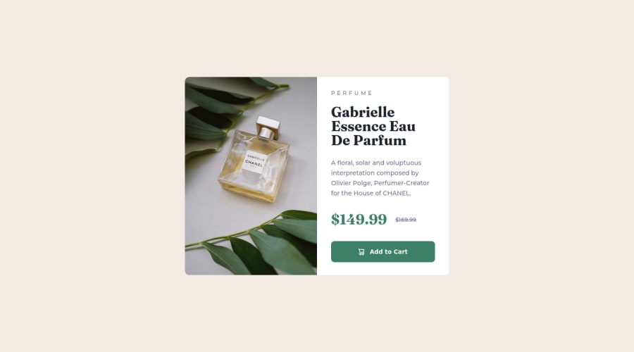
Hello fellow web devs, This is my first try in the past 4 or 5 months, I wanted to start integrating my new dev skills such as Svelte used in this project, even though I didn't do any app structure or props passing to this component, but I wanted to start getting the hang of the tools available.
I found the the background-image CSS a little tricky to use, but I wanted to try something new for me. I think that I would have to use an inline style if I were to use it as part of the component in an app. How would you guys go about passing the images as props and still be able to change from the desktop to the mobile version of the image?
Community feedback
- Account deleted
Hey there! 👋 Here are some suggestions to help improve your code:
- For this challenge you want to use the Picture Element not the Background Image Property. The Background Image Property is mainly used on decorative images
Picture Element will allow your to switch between images in different breakpoints and makes your site load faster by saving bandwidth.
- Here is an example of how it works: EXAMPLE
Syntax:
  <picture>
    <source media="(min-width: )" srcset="">
    <img src="" alt="">
  </picture>
More Info:
https://www.w3schools.com/html/html_images_picture.asp
https://web.dev/learn/design/picture-element/
-
The only heading in this challenge is the name of the perfume, “Gabrielle Essence Eau De Parfum” . The rest of the text should be wrapped in a Paragraph Element.
-
The old price 🏷 is not being announced properly to screen readers. You want to wrap it in a Del Element and include a sr-only text explaining that this is the old price.
-
The "shopping cart" icon 🛒 is decorative, so its Alt Tag should left blank and have an aria-hidden=“true” to hides it from assistive technology.
-
Your button needs to have
box-shadowandcursor: pointer.
If you have any questions or need further clarification, let me know.
Happy Coding! 👻🎃
Marked as helpful1@newbpydevPosted over 2 years ago@vcarames Hi there, excellent feedback, I have never used the picture element, thanks so much for this tip, I will use it on tomorrow's challenge.
I forgot to mention the tips for the screen readers, thanks as well. I always have an issue with the right time of using the h1-6 tags, even in this component since I always hear that a page should have one h1 tag, but in this article, I used it. So quick question, should every article have its own heading part, starting from h1? Thanks, in advance.
0Account deleted@newbpydev
In a full site, you would always start with an <h1> Heading. Also keep in mind that you can only use the <h1> Heading once per page.
Since these are components, in a real site, they would have a lower heading level (<h3>, <h4>, etc...). They would never have an <h1> Heading.
But for these challenges, it's ok to give them the <h1> Heading.
Marked as helpful0@newbpydevPosted over 2 years ago@vcarames Thank you again for the reply, I understand it much better now, and I will apply this knowledge on my next challenge, it is time to do a full page, so it's the perfect time to practice this. Thanks again for the insight.
0 - @mclanecorpPosted over 2 years ago
Well done, good job
1@newbpydevPosted over 2 years ago@mclanecorp Thank you very much, I am trying new things on every challenge, and I hope to help others that are new as well.
0
Please log in to post a comment
Log in with GitHubJoin our Discord community
Join thousands of Frontend Mentor community members taking the challenges, sharing resources, helping each other, and chatting about all things front-end!
Join our Discord
