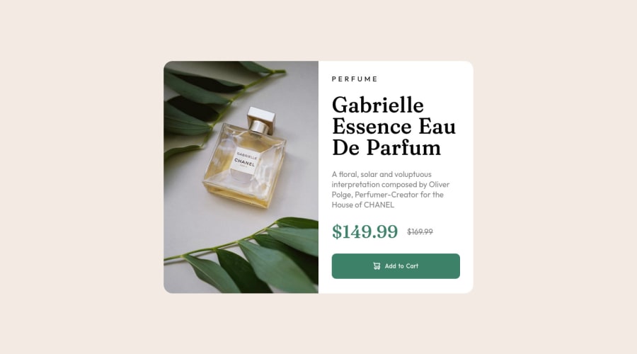
Design comparison
Solution retrospective
Again, I struggled a little with the responsive part of the development.
I missed the usage of the tag "<meta name="viewport" content="width=device-width, initial-scale=1">", which makes the page scale properly depending on the screen size/resolution, took me a while to figure that out, but all ended up being ok.
I also still didn't found a way to match the design text without using bigger font-sizes from the especified in the style-guide.md.
Community feedback
- @Tryt4nPosted almost 2 years ago
-
it's better when you use
delelement instead ofstrikeand also you can put actual price instrongoremelement to emphasize. Also you supposed to have only oneh1element on the page so the title is ok, but price shouldn't be inh1element even if you wouldn't have any one the page. -
for responsiveness it's good to use
clampin CSS. Like:font-size: clamp(1rem, 3vw, 2rem);padding: clamp(0.5rem, 7vw, 0.75rem)
You can try with different numbers. First is for smallest and third is for biggest. Middle value is for change and it's supposed to by in
vwbut you can try with different numbers depending from screen size and values.Marked as helpful1@JassonJrPosted over 1 year ago@Tryt4n Thank you so much for these tips, they're really helpful and I'll try to implement them as much as possible on the next projects.
I also used them a little bit to refactor the code of this solution, and removed the h1 tag from the price as you warned.
0 -
Please log in to post a comment
Log in with GitHubJoin our Discord community
Join thousands of Frontend Mentor community members taking the challenges, sharing resources, helping each other, and chatting about all things front-end!
Join our Discord
