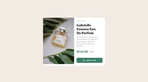
Submitted over 1 year agoA solution to the Product preview card component challenge
Product review card component main using HTML and CSS
P
@tonyiboy

Solution retrospective
What are you most proud of, and what would you do differently next time?
I learned how to switch another photo when layout shift.I used picture element but hope on anoter project I could do same or similar thing by using only srcset and sizes.I think picture gives you more control what picture to use while with sizes browser decides what is situation and then picks photo
What challenges did you encounter, and how did you overcome them?Tryed to do as much as possible same as design I think I did pretty close.
What specific areas of your project would you like help with?Any new thing anything layout better css I would love to hear different perspective and would like to learn and apply it next time in other projects
Code
Loading...
Please log in to post a comment
Log in with GitHubCommunity feedback
No feedback yet. Be the first to give feedback on Antonio's solution.
Join our Discord community
Join thousands of Frontend Mentor community members taking the challenges, sharing resources, helping each other, and chatting about all things front-end!
Join our Discord