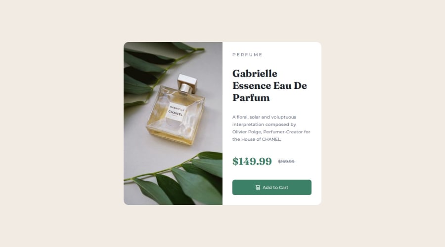
product-review-card-component HTML&CSS responsive layout solution


Design comparison

Solution retrospective
I'm least proud of class names and would definitely redo 'em.
What challenges did you encounter, and how did you overcome them?There were many possible approaches to solving responsive layout and I choose flexbox and mobile first. Only challenge was resetting image size to display the product image because I choose to use background-image and css instead of html and img tag. Overcame it tho quick and easy enough with relative widths.
What specific areas of your project would you like help with?If u have the time please review my solution I'm interested in all feedback. Thanks!
Community feedback
- P@lia-oliveiraPosted 4 months ago
Hi there! I found your solution to be excellent—great job! The design looks exactly as it should, and your repository and code are well-organized. You used the BEM naming convention for your classes, which makes analyzing your solution much simpler.
I also think the class names are appropriate, especially if you plan to use this component in a larger project. To make the names more concise, you could use just product-preview instead of product_preview_card, or simply content instead of text-content.
Regarding the image, it reflects the textual content rather than being decorative. For accessibility purposes, it might be better to include it in the HTML with an alt attribute.
I also noticed there are no landmarks in your code. For better accessibility, it might be a good idea to include at least a <main> tag to indicate that the card is the main content of your page. This can be very helpful for screen readers. Keep going!
Marked as helpful0@stezorPosted 4 months agoHi @lia-oliveira
Firstly I wanna thank u for taking the time to review my code and write such detailed feedback. I really appreciate it and it's really helpful!
Secondly I absolutely agree with all of your suggestions about img, main and shortening of the class names. However the only reason it looks the way it looks is that I took more of a demo component approach as opposed to what I would do if it was part of a larger project. css background-image gives me more freedom when it comes to styling, class names even tho too long r as u said very descriptive, and I have absolutely no landmarks in my code simply because it's only a component and there's no rest of the actual page. But again, I absolutely agree with what u said and I think your suggestions were spot on! Thanks again.
1 - @Asem-MamdohPosted 4 months ago
How are you, my friend? I hope you're doing well. There's only one comment and I hope you'll review it and if you need any help, I'm at your service.
You need to adjust the image size to fit all sizes.
Good luck, brother.
0@stezorPosted 4 months agoHi @Asem-Mamdoh
I doing well, thanks. I hope u do as well.
Thank u for your feedback and offer to help. I appreciate it.
As for your suggestion I think I understood what u meant and there's simple solution to that.
0


Please log in to post a comment
Log in with GitHub
Join our Discord community
Join thousands of Frontend Mentor community members taking the challenges, sharing resources, helping each other, and chatting about all things front-end!
Join our Discord