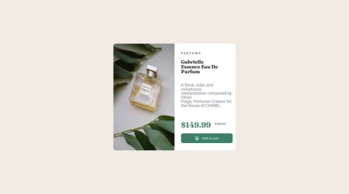
Not Found
Not Found
Not Found
Not Found
Not Found
Not Found
Not Found
Not Found
Not Found
Not Found
Not Found
Not Found
Not Found
Not Found
Not Found
Not Found
Not Found
Not Found
Not Found
Not Found

Submitted

Product review card component, first time using media querry

1lija 80

@1lija

Desktop design screenshot for the Product preview card component coding challenge

This is a solution for...

  • HTML
  • CSS
1newbie
View challenge

Design comparison


SolutionDesign

Solution retrospective


What challenges did you encounter, and how did you overcome them?

A lot of challenges with media query since it was the first time using it. ex. font size not changing when reaching a different width and height in query and staying the same as it was before. Googling helped

Community feedback

Adriano 36,730

@AdrianoEscarabote

Posted

Hi 1lija, hope you're doing well! I loved how your project turned out, but I’ve got a few suggestions that could be useful:

Use the THE PICTURE TAG that is a shortcut to deal with the multiple images in this challenge. So you can use the <picture> tag instead of importing this as an <img> or using a div with background-image. Use it to place the images and make the change between mobile and desktop, instead of using a div or img and set the change in the css with display: none with the tag picture is more practical and easy. Note that for SEO / search engine reasons isn’t a better practice import this product image with CSS since this will make it harder to the image. Manage both images inside the <picture> tag and use the html to code to set when the images should change setting the device max-width depending of the device desktop + mobile.

Check the link for the official documentation for <picture> in W3 SCHOOLS: https://www.w3schools.com/tags/tag_picture.asp

See the example below:

<picture>
  <source media="(max-width:650px)" srcset="./images/image-product-mobile.jpg">
  <img src="./images/image-product-desktop.jpg" alt="Gabrielle Parfum" style="width:auto;">
</picture>

The rest is fantastic.

Hopefully, you'll find it helpful. 👍

Marked as helpful

1
gozica 50

@gozica

Posted

The solution includes semantic HTML and is mostly accessible. The layout is responsive, the code is well-structured and reusable, and it closely matches the original design.

0

Please log in to post a comment

Log in with GitHub
Discord logo

Join our Discord community

Join thousands of Frontend Mentor community members taking the challenges, sharing resources, helping each other, and chatting about all things front-end!

Join our Discord