

Design comparison

Community feedback
- @dar-juPosted 4 months ago
Hi Tomisin Akinyemi!
In this task you don't need to use tag section, it's more like article.
Section is a full part of the page, for example, in an online store there can be sections - banner, popular products, sale and so on.
You use a hard scheme for replacing an image at different resolutions, read about tag picture
In this task it will look like this:
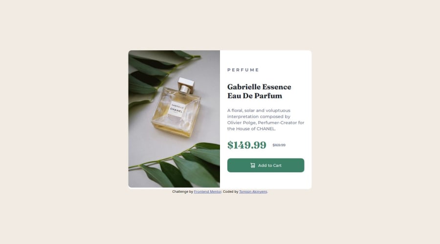
<picture>
  <source media="(max-width: 615px)" srcset="./images/image-product-mobile.jpg">
  <img src="./images/image-product-desktop.jpg" alt="Gabrielle Essence Eau De Parfum">
</picture>
And be sure to use alt, if the picture does not load, then it is clear what is depicted there, and search engines read what is written there.
So, good luck in your projects!
Marked as helpful0@donttouchtomiPosted 4 months ago@dar-ju Thank but can you explain how I will edit it on the CSS because I had a very hard time using the Flexbox and sizing it
0@dar-juPosted 4 months ago@donttouchtomi, in short - you need to use 2 containers with flexbox in this case. The first and main one is where the picture is on the left and the text block on the right, they are horizontal. The second flex text is the block on the right, it is vertical.
The most interesting and understandable manual I found is https://css-tricks.com/snippets/css/a-guide-to-flexbox/ If it is may be difficult, do not study it in detail, just run through the basic concepts.
But here is a simulator, if you want to know flex, then go through it completely, it is worth it https://flexboxfroggy.com/
0

Please log in to post a comment
Log in with GitHubJoin our Discord community
Join thousands of Frontend Mentor community members taking the challenges, sharing resources, helping each other, and chatting about all things front-end!
Join our Discord