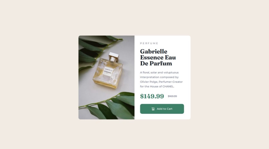
Design comparison
Solution retrospective
It was a little scary to finish mobile layout only to see the desktop mock, with the whole card on its' side. But this problem highlights the beauty of CSS selections. I simply changed the container flex direction, resized the div, and pleasantly surprised how far along it got me.
I also noticed I'm wasting dev time on fine-tuning spacing one section at a time. I think if I start with the bigger changes across all elements (eg. font size), I will spend less time double-handling fiddling with margins to get it perfect.
What challenges did you encounter, and how did you overcome them?I struggled most of all with the icon. My initial approach was an old school , but struggled to find the control I needed. I eventually tried a class to insert image via CSS, and instantly found control much easier.
I refactored HTML in the desktop stage, to wrap text content in a container for center-aligning. I think it's still decent practice rather than a rookie mistake. There simply was no need in mobile portrait, but was a need for desktop landscape.
What specific areas of your project would you like help with?It felt like I spent a lot of lines fine-tuning margins. I possibly could get the layout in a more elegant way.
Community feedback
Please log in to post a comment
Log in with GitHubJoin our Discord community
Join thousands of Frontend Mentor community members taking the challenges, sharing resources, helping each other, and chatting about all things front-end!
Join our Discord
