Product Preview with Cart Animations and Background Styling

Solution retrospective
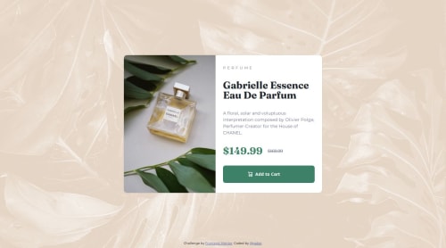
I am happy with the slight design changes that I made. The background has a little bit more texture now without being overwhelming, and the Add to cart button has a little bit of animation to spice it up. I think I might simplify animations in the future. I have a feeling that my approach is too cumbersome - but I need to research this a little more.
I had a little bit of difficulty determining how to use the <picture> element at first. Once I figured it out I fell in love with how simple it is to responsively swap out images.
Any feedback is great. If anybody has insight into css animations or the logic that controls them in the JS, I'd love some resources.
Please log in to post a comment
Log in with GitHubCommunity feedback
No feedback yet. Be the first to give feedback on Gabe's solution.
Join our Discord community
Join thousands of Frontend Mentor community members taking the challenges, sharing resources, helping each other, and chatting about all things front-end!
Join our Discord