

Design comparison
SolutionDesign

Solution retrospective
What are you most proud of, and what would you do differently next time?
I'd like to start paying attention to the accessibilty report and the read.me. If you have a good example of what a good read.me looks like I'd love to refine my github.
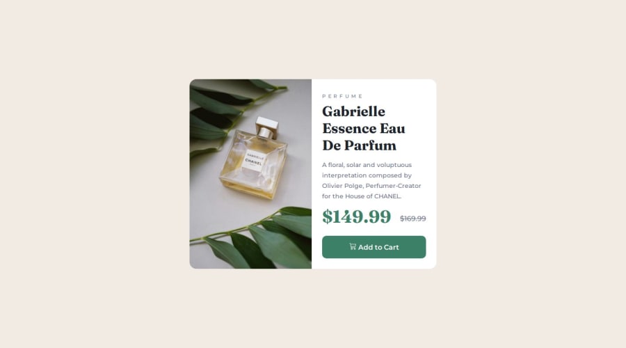
What challenges did you encounter, and how did you overcome them?Adding the icon to the add cart. I wasn't able to resize but happy I was able to get close with bootstrap icons.
What specific areas of your project would you like help with?I should get better at using landmarks. I just realized that it's best practice to design for mobile first. any other relevant best practices would help. I was not able to maintain the centerline of the prices. Please take a look and advise.
Community feedback
Please log in to post a comment
Log in with GitHubJoin our Discord community
Join thousands of Frontend Mentor community members taking the challenges, sharing resources, helping each other, and chatting about all things front-end!
Join our Discord