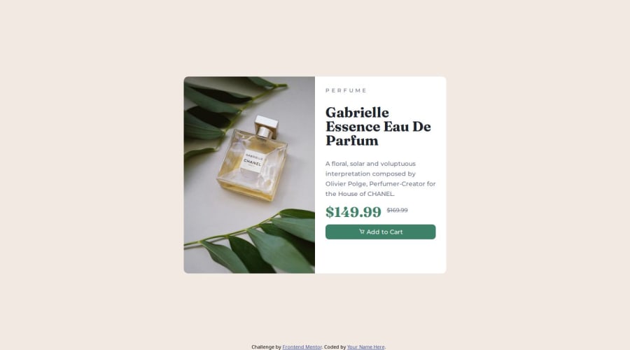
Design comparison
Solution retrospective
Made a lot of changes based on feedback and looking for anything else that anyone is willing to help me with.
Please check out the live site to check responsiveness and if there is anything I should make changes to.
Thank you!
Community feedback
- @kyusufmPosted 9 months ago
Hi Craig,
Small suggestion for the card.
- for the button you can use
border:none
so the black border didnt show - Try to remove 700 font-weight on the button
for the image, you can add wrapper on top of the image, and set
overflow hidden
in the.card
and i think you forget to text-transform the "perfume"
Marked as helpful0@cchiversPosted 9 months ago@kyusufm I made the changes that you have recommended, but I am running into the issue that I don't know how to implement the overflow hidden or mask that you are speaking off. Do you have any examples that I could look at to make that correction.
I was originally trying to do something similar where the border-radius is auto depending on orientation without trying to hard set that value in CSS, but instead try and mask it based off the card border-radius.
0@kyusufmPosted 9 months ago@cchivers
You can add it inside the card class
.card { overflow:hidden; }
this will help you to not put border radius in your image. so you can remove all border-radius that attach to image i.e:
border-bottom-left-radius: 10px;
You should use 2 image. first is the desktop, second is the mobile. From current code you are using the mobile. If you change the current image to desktop it will look better
<img src="./images/image-product-mobile.jpg" alt="">
change it to <img src="./images/image-product-desktop.jpg" alt="">another thing is, add class to the image so we will display each image on specific screen size. for example:
<img src="./images/image-product-mobile.jpg" alt="" class="mobile">
willdisplay:none
if screensize is larger and will shown if screensize is smalleryou can check this sample https://perfume-product-kyusufm.vercel.app/
Best of luck!
Marked as helpful0@cchiversPosted 9 months ago@kyusufm
Thank you so much, I was able to fix my issues and update the code accordingly. It works better on responsive side now.
0 - for the button you can use
Please log in to post a comment
Log in with GitHubJoin our Discord community
Join thousands of Frontend Mentor community members taking the challenges, sharing resources, helping each other, and chatting about all things front-end!
Join our Discord