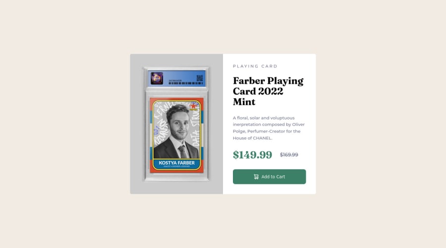
Product Preview using React/SCSS. Custom Product! Trying to use BEM!
Design comparison
Solution retrospective
This one was a fun one! I decided to dip my feet into the world of React.
It was definitely overkill for this project but the point of it was to start getting comfortable with React and it's workflow and syntax.
I tried to have more structure to my SCSS. I added a CSS reset to revert some settings to make development easier.
I also spiced things up and made a product card... of myself as a graded collectible. Not a bad price either 😏.
Please feel free to give feedback on my React code, project structure etc.
Keep on coding!
Community feedback
- @HaroonabdulrazaqPosted over 2 years ago
Hello Kostya,
Your project is very beautiful and the code is neatly arranged. I wish you can hear me clapping here. Your project structure is very good and followed best practice. One thing I would like to point out is the use of sass/scss.
-
It would be best you install node-sass, it's an npm package that allows you use sass/scss directly in your React application. Currently, I noticed the scss is converted to .map.css or css.
-
You can also watch this tutorial to assist you with using scss for different screen-size. You can learn more about it here
Lastly good job on the README.md file. To show recruiters the responsiveness of my project. I use a screenshot from here.
How to Use
- Paste you Live link in the input field and click Go.
Don't forget to mark this comment as helpful if it was helpful.
Marked as helpful1@kostyafarberPosted over 2 years ago@Haroonabdulrazaq Oh thanks I haven't heard of node-sass! Thanks I'll definitely use it in my next project.
Oh cool! I will look into this syntax for media queries thanks for that too!
Awesome thanks for the screenshot link! That's a life hack right there.
Thanks for the feedback.
Happy coding.
1@HaroonabdulrazaqPosted over 2 years ago@kostyafarber I am glad it was help, Happy coding
1 -
- @abhik-bPosted over 2 years ago
Hey Kostya 👋
Your solution looks fantastic . I liked the concept of you as a product card 😁 Your react component
previewis great & the structure you used to name the classes seems good.Just a opinion : adding some padding to
.rootdiv will give some spacing to the card in mobile screens.Fantastic job , keep up contributing such amazing solutions 🥳
Marked as helpful1@kostyafarberPosted over 2 years ago@abhik-b Hey there!
Thanks for the feedback. It really means a lot 🙂.
Sure thing I'll make sure to include that in my next project! Thanks for the valuable insight. Still getting used to navigating between HTML and React framework.
Thanks for the helpful advice!
Happy coding!
1
Please log in to post a comment
Log in with GitHubJoin our Discord community
Join thousands of Frontend Mentor community members taking the challenges, sharing resources, helping each other, and chatting about all things front-end!
Join our Discord
