Submitted over 1 year ago
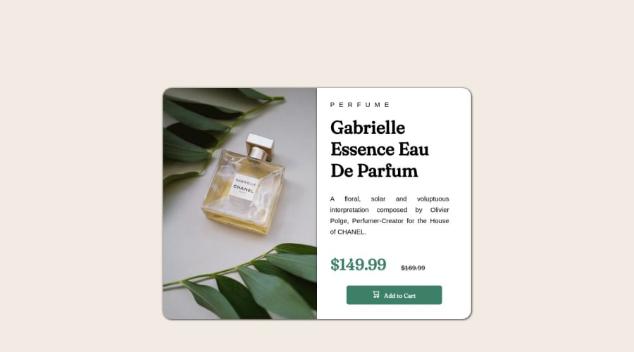
Product preview solution using Flexbox and CSS custom properties
@Kothe-1
Design comparison
SolutionDesign
Solution retrospective
Did i overdid in my CSS code? I would like to know if there was any possible way to compact my CSS and if i repeated any elements or properties unnecessarily. Since i really knew to HTML and CSS i'm afraid i must be over complicating things.
Community feedback
Please log in to post a comment
Log in with GitHubJoin our Discord community
Join thousands of Frontend Mentor community members taking the challenges, sharing resources, helping each other, and chatting about all things front-end!
Join our Discord
