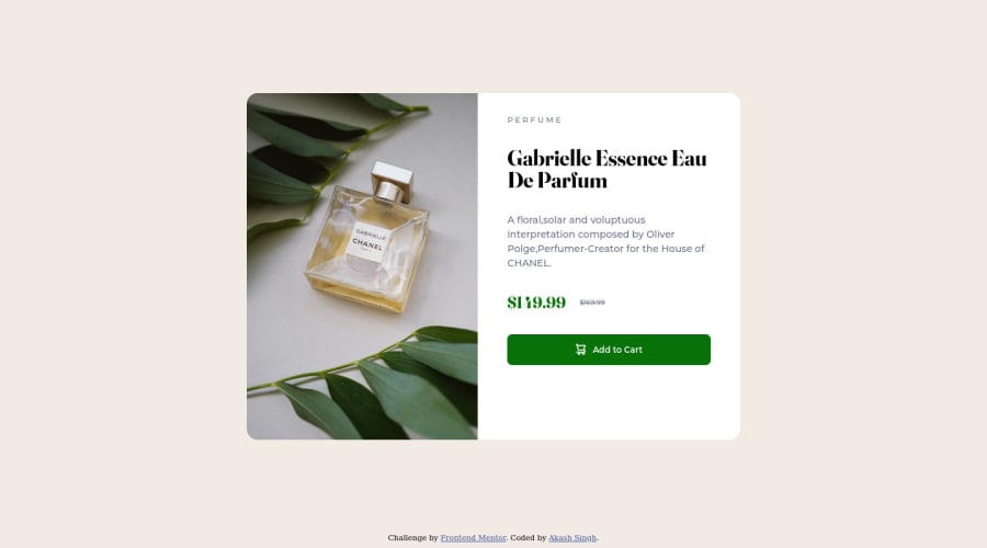
Product preview responsive page using Flex-box and viewport units.
Design comparison
Solution retrospective
Hi everyone. This was my first challenge. Had lots of fun doing hit and trial. I had a tough time dealing with and resizing images and making them responsive. Also, how do I make this layout without using flex-basis:100%? Kindly provide your feedback regarding my CSS and how to be much better at making responsive layouts.
Community feedback
- @elaineleungPosted over 2 years ago
Hi Akash, I think at the desktop view, instead of a
flex-basis: 100%
, tryflex-basis: 50%
. You can even do the short hand offlex: 1 1 50%
for both theimg_child
andtext_child
if you anticipating a smaller view where contents might need to shift to change the container size before it changes to the mobile view.Other things I'd do is, I'd change the width to
min(88%, 600px)
and the margin tomargin: 0 auto
(or what I normally use ismargin-inline: auto
). For the mobile view, I'd change the height to a fixed height of 15rem and remove the flex basis, or if you refer really want something responsive for the height (which is what I used in my challenge as well), I'd suggestclamp()
instead because it doesn't seem like the responsive properties are working.Hope this helps!
Marked as helpful0@akash-singh95Posted over 2 years ago@elaineleung Hi Elaine, Thanks for your feedback. I redid the project, and it turned out a lot better than before. Instead of going for flex-basis 100% this time, I went for flex-basis 0 and a flex-grow factor. would you be kind enough to review my new take? https://akash-singh95.github.io/Product-preview-challenge/
thanks again
1@elaineleungPosted over 2 years ago@akash-singh95 Hi Akash, you're welcome, and the site looks great! Other comments I have are, instead of a fixed height on the html and body, you can use a responsive
min-height
. Also, I see that you have the height property on yourhtml
,body
, andmain
; you only really need it on thebody
. Right now, because you have a 100vh on the main, it's trying to stretch to that size, which is why you need to use the margins. Try removing the height for the main while changing theheight
tomin-height
on body, and remove all the top margins, and see whether that centers the component.You can try commenting out certain rules and then refreshing to see whether that rule has any effect; I know how often times we add stuff in our code while trying to troubleshoot, and then later the code is super bloated. For instance, you'll find that you might not need
height:auto
as a rule, which is something I never really need to use.Good luck!
Marked as helpful0@akash-singh95Posted over 2 years ago@elaineleung Thanks again elaine. Some doubts: 1)How are body { min-height:100vh & body{height:100vh different? They both ultimately point to 100vh. 2)I am having trouble centering my containers because they are nested within the semantics tags. How do I take control of this?
0@elaineleungPosted over 2 years ago@akash-singh95 Akash, I wrote up some CodePens to answer your two questions since I think it's probably better to show you than try to explain:
- About responsive min-height vs. fixed height:
Here's an example of
height:100vh
: https://codepen.io/elaineleung/pen/JjLpXOBHere's an example of
min-height:100vh
: https://codepen.io/elaineleung/pen/eYMVZzWI put in a blue outline as well to show you where the containers are; you'll have to make the browser height smaller by resizing the window, and then see if you can compare what's happening with the gradient background.
- About centering the containers:
I took your code in your repo and basically just commented out lines you don't need and added a few in: https://codepen.io/elaineleung/pen/dymdXZY. I didn't change the
margin-top
in the mobile view since it's not such a huge difference, but I probably would choose a slightly smaller margin. You can see which lines I commented out and how they make a difference when centering the component.Hope this helps!
Marked as helpful0@akash-singh95Posted over 2 years ago@elaineleung wow, that was really something. I didn't even consider these scenarios, thanks a lot, I learned something new today. Looking forward to more interactions with you :D.
1@elaineleungPosted over 2 years ago@akash-singh95 Glad I could help, and yes, looking forward to more!🙂
0
Please log in to post a comment
Log in with GitHubJoin our Discord community
Join thousands of Frontend Mentor community members taking the challenges, sharing resources, helping each other, and chatting about all things front-end!
Join our Discord