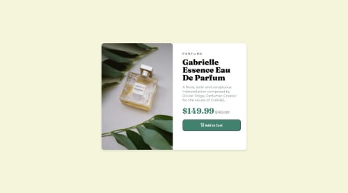
Product preview responsive design using media query

Solution retrospective
This was my first (intentional) responsive website ever! I'm proud of how i was able to make the design as close as i could.
What challenges did you encounter, and how did you overcome them?I had a problem where, once the screen was wide enough, the image would change to the desktop version and take up the entire screen. The weird thing is this didn't happen on Firefox (it worked as intended). I ended up fixing it by updating the image's height to auto. I believe what happened was that I set the height to auto once to test it on Firefox and then removed it to see what would happen. It still worked, so I didn't use it again. My guess is that Firefox saved the image's height in cache and was able to use that
What specific areas of your project would you like help with?Could you please review my CSS code and provide feedback on the following aspects:
Code structure and organization Cross-browser compatibility Responsive design Flexbox usage Performance Styling consistency Best practices
I'm particularly interested in any suggestions for improving the layout and ensuring it works consistently across different browsers and devices."
Please log in to post a comment
Log in with GitHubCommunity feedback
No feedback yet. Be the first to give feedback on Chris's solution.
Join our Discord community
Join thousands of Frontend Mentor community members taking the challenges, sharing resources, helping each other, and chatting about all things front-end!
Join our Discord