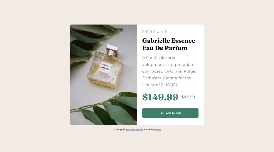


Design comparison

Solution retrospective
I retried doing this project! Many things I bet.
What challenges did you encounter, and how did you overcome them?Responsive fonts. Responsive everything I guess.
What specific areas of your project would you like help with?How can I make things responsive easily? Also what is best for me to learn next?
Community feedback
- @KapteynUniversePosted 6 months ago
Hey nimbo, i saw your message and checked your code.
Try not to use hard coded values like
height: 90vh;, you can use min-max if you need. For example in your article.container height was causing issues, i deleted it and added amax-width: 25emand kept thewidth:90vwwith this way article width is 25 em to a point and around 400-450px screen size it will be 90vw. I picked 25em randomly btw. This should correct the mobile layout.article.container { display: flex; flex-direction: column; overflow: auto; width: 90vw; max-width: 25em; /* height: 90vh; */ border-radius: .5em; background-color: white; }For the desktop layout:
I deleted 1024px and 1440px media queries. You can use them if you want for the font sizes, also use rem for the font sizes. There are a couple of videos of Kevin Powell about em/rem units, i recommend you to check them.
/*
@media (min-width: 1024px) {
  article.container {
      height: 40vh;
      width: 80vw;
      overflow: auto;
  }
}

@media (min-width: 1440px) {
  article.container {
      width: 50vw;
      height: 65vh;
      overflow: hidden;
  }

  h2.reduced-price {
      font-size: 1.5em;
  }

  h1.perfume-name {
      font-size: 2.2em;
  }

  p.perfume-description {
      font-size: 1.2em;
  }

}
  */
and just changed max-width in the 760px media query to 45em. Again just a random pick. You can use another value, max-content or fit-content. With fit or max content it will be big on big screens again and needs to add
justify-content: space-between;to the div.second-col.@media (min-width: 760px) { article.container { flex-direction: row; /* height: 50vh; */ /* width: 90vw; */ max-width: 45em; /* overflow: auto; */ } . . . }Also you don't need to repeat the codes after media queries unless if you used a between query like
@media (min-width:400px) and (max-width:900px)Marked as helpful0@KapteynUniversePosted 6 months agoBy the way i used em for the max-width here but probably using rem would be better. Looks like most of the times we should use rem unit, i am getting used to it too.
Marked as helpful0@7bibiPosted 6 months agoThank you very much for taking the time to replay! max-width was really the magic word, it helped a lot and I understood that the height was the root of my problems. You mentioned many useful tips and resources I didn't know about! I wish you the best @KapteynUniverse
1

Please log in to post a comment
Log in with GitHub
Join our Discord community
Join thousands of Frontend Mentor community members taking the challenges, sharing resources, helping each other, and chatting about all things front-end!
Join our Discord