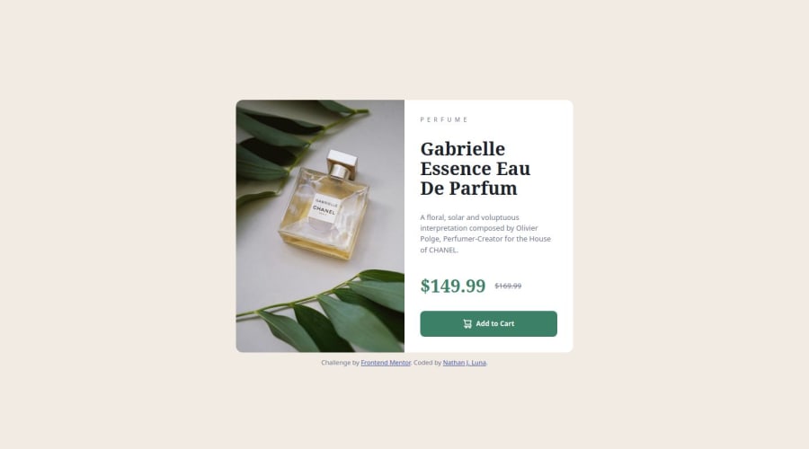


Design comparison

Solution retrospective
I'm not very proud of how much I was able to achieve by myself. I ended up having to reach out to other outside resources/walkthroughs and follow them.
What I have realized (despite the article section before this challenge), was that I DEFINITELY should've constructed the page from mobile-view first.
At the very least, I am proud of how much more eligible or clean my HTML and CSS has looked compared to my first few Frontend Mentor projects.
What challenges did you encounter, and how did you overcome them?The deeper I got into working on this challenge, the more I realized how much property types I didn't know about when looking at other resources.
My very first attempt was creating it based off of desktop-view, and it was very awkward for me trying to switch the layout between the two. I wasn't able to figure out how to change the layouts with the @media under my own knowledge.
So how did I "overcome" these challenges? Most of what I got out of this challenge was learning from the video. I learned about the element, srcsets, grid displays, the importance of the rem unit, and many more properties that I'm not used to.
What specific areas of your project would you like help with?I'm very bummed that I wasn't able to complete this on my own, however I felt like I have learned a lot from the resources I used. I would like some more advice on how or when to determine the mobile/desktop formatting (which one to do first over the other).
Resources -
Kevin Powell's Video: https://www.youtube.com/watch?v=B2WL6KkqhLQ
Josh Comeau's CSS Reset: https://www.joshwcomeau.com/css/custom-css-reset/
Community feedback
Please log in to post a comment
Log in with GitHub
Join our Discord community
Join thousands of Frontend Mentor community members taking the challenges, sharing resources, helping each other, and chatting about all things front-end!
Join our Discord