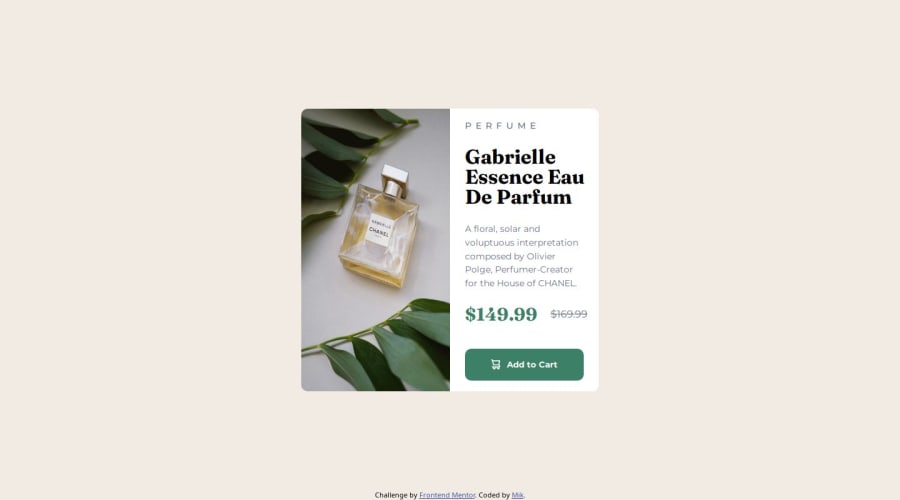
Design comparison
SolutionDesign
Solution retrospective
What are you most proud of, and what would you do differently next time?
It didn't took me so long to make only up to 5h... which is good for me I think as a beginner. I would STRICLY do one thing completely and go to another. I did that but not all the time.
What challenges did you encounter, and how did you overcome them?I was really struggling with the image and for it to be 50% of the container with matching height and width to div next to it. I think solved it by setting min-hight: 100%. idk
What specific areas of your project would you like help with?I would like to get some advice how to do better with paddings and margins and spacing in general and if it is responsive and uses optimal standards :)
Community feedback
Please log in to post a comment
Log in with GitHubJoin our Discord community
Join thousands of Frontend Mentor community members taking the challenges, sharing resources, helping each other, and chatting about all things front-end!
Join our Discord
