Not Found
Not Found
Not Found
Not Found
Not Found
Not Found
Not Found
Not Found
Not Found
Not Found
Not Found
Not Found
Not Found
Not Found
Not Found
Not Found
Not Found
Not Found
Not Found
Not Found

Submitted

Product Preview Page

SirKaleβ€’ 30

@SirKale

Desktop design screenshot for the Product preview card component coding challenge

This is a solution for...

  • HTML
  • CSS
1newbie
View challenge

Design comparison


SolutionDesign

Solution retrospective


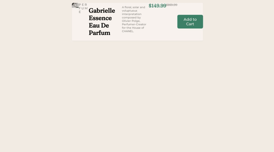
Hello. Here is my submission. I have been having rpoblems with responsive design as the image is shrinking and resizing and not staying fixed next to the card. I also had trouble with the button in placing it as well as importing the shopping cart icon. Feedback is very much appreciated regarding these and other quirks with my code that you may find. Thanks!

Community feedback

Account Deleted

Hi @SirKale,

I really want you to learn flexbox or grid systems very well, and then try to re-build this challenge, it seems like you're facing a lot of problems with the design and responsive design

and there are a simpe way to make media query to the images using <picture> tag, search for it to learn more about it

good luck in the next, you can see others solutions and compare them with yours to learn more ways how to do this solve this challenge 😊

Marked as helpful

1

SirKaleβ€’ 30

@SirKale

Posted

@MasterMousa

Will do. Thanks for telling me this!

1

Account Deleted

@SirKale you're welcome 😊

0
Abdul Khaliq πŸš€β€’ 72,660

@0xabdulkhaliq

Posted

Hello there πŸ‘‹. Congratulations on successfully completing the challenge! πŸŽ‰

  • I have other recommendations regarding your code that I believe will be of great interest to you.

CSS 🎨:

  • Looks like the component has not been centered properly. So let me explain, How you can easily center the component without using margin or padding.
  • We don't need to use margin and padding to center the component both horizontally & vertically. Because using margin or padding will not dynamical centers our component at all states
  • To properly center the component in the page, you should use Flexbox or Grid layout. You can read more about centering in CSS here πŸ“š.
  • For this demonstration we use css Grid to center the component.
body {
    min-height: 100vh;
    display: grid;
    place-items: center;
}
  • Now remove these styles, after removing you can able to see the changes
main {
  margin: 15px 20px 20px 25px;
}
  • Now your component has been properly centered

.

I hope you find this helpful πŸ˜„ Above all, the solution you submitted is great !

Happy coding!

Marked as helpful

0

SirKaleβ€’ 30

@SirKale

Posted

@0xAbdulKhalid Thank you so much! It worked and now I have a general idea on how to center things. Thank you once again!

0
Raul Rebolledoβ€’ 230

@rrebolledo90

Posted

Hey, I looked this over on my phone and your design is looking fine on a smaller screen. I’m thinking that the issue is the desktop version. I know that many users state that a mobile design should come first, but as a new developer that is really hard to do especially when you’re just learning. I think you should focus on getting the desktop version responsive and then you can work your way towards applying media queries at certain breakpoints when you notice your images not necessarily responding the way you would like them to.

Marked as helpful

0
Saad Hishamβ€’ 1,750

@Saad-Hisham

Posted

Great work! πŸ‘ Let me explain a little bit about the div element and how it can be used to contain other elements.

Think of a div as a container or a bag that holds other elements. Instead of carrying all your stuff separately, you can put them in a bag and carry them all at once. That's what the div does for your web page - it holds other elements together and keeps them organized.

When using the flexbox layout, the elements are lined up horizontally. But sometimes you might want to split them into two rows. In that case, you can create a parent element and give it a display: flex value to turn it into a flex container. Then, you can place two divs inside it to hold the image and the content, respectively. This will make the elements appear in two rows.

Here's an example:

<div style="display: flex; flex-wrap: wrap;">
  <div>
    <img src="image.jpg" alt="Image">
  </div>
  <div>
    <h2>Title</h2>
    <p>Content goes here.</p>
  </div>
</div>

In this example, the parent div has a display: flex value and a flex-wrap: wrap property to wrap the elements onto a new line when the container gets too narrow. The first div holds the image, and the second div contains the title and the content. finally don't forget to wrap each element in div like one div for the heading one for paragraph etc to make sure every thing is orgainzed

I hope this helps! Keep up the great work! πŸ’–

0

Please log in to post a comment

Log in with GitHub
Discord logo

Join our Discord community

Join thousands of Frontend Mentor community members taking the challenges, sharing resources, helping each other, and chatting about all things front-end!

Join our Discord