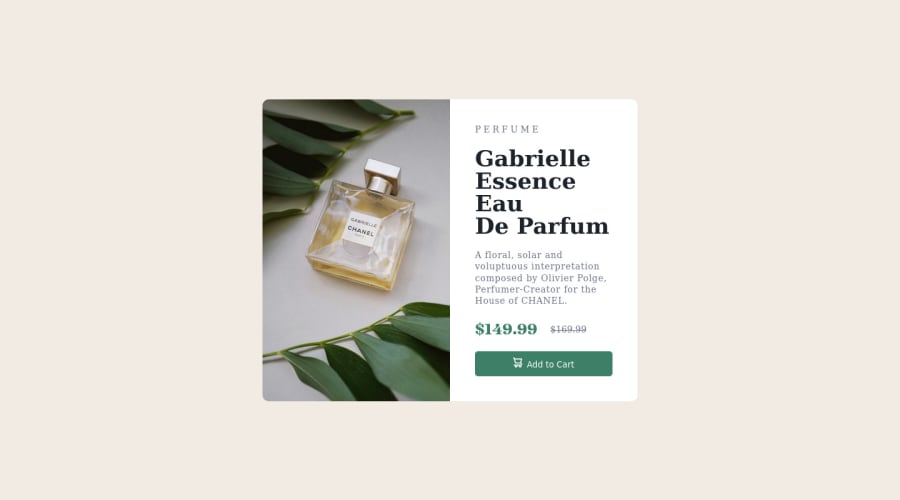
Design comparison
Solution retrospective
had fun doing this one, I believe I improved by writing more reusable code. if there's a way I could have done better please feel free to suggest to me, thank youu xD
Community feedback
- @VCaramesPosted about 2 years ago
Hey, some suggestions to improve you code:
-
Your content isn't accessible at all.
-
The Background Image Property is only to be used on decorative images. NOT images that add value and serve a purpose. For this challenge you want to use the Picture Element. By using this element not are able to use different size images, you can also save on bandwidth, meaning your content loads faster.
-
Syntax:
<picture> <source media="(min-width: )" srcset=""> <img src="" alt=""> </picture>
Source:
https://www.w3schools.com/html/html_images_picture.asp
https://web.dev/learn/design/picture-element/
-
Once you fixe the image issue, you'll want to include an Alt text tag with them. Inside that Alt Tag you want to describe what the image is; they need to be readable. Assume you’re describing the image/icon to someone.
-
There should only be one heading in this challenge and thats for the Perfume’s Name. Everything else should be using a Paragraph Element.
-
The old price isnt being announce properly to screenreaders. You want to wrap it in a Del Element and include a sr-only text explaining that this is the old price.
-
The "shopping cart" icon is decorative, so its Alt Tag needs to be left blank.
-
Your content isnt responsive at all. You're going to want to add media queries.
-
To make it easier to deal with CSS , have more control over your content, and ensure that your content will look the same regardless of browser used I suggest using CSS Resets.
Here are few CSS Resets that you can look at and use to create your own CSS Reset or just copy and paste one that already prebuilt.
https://www.joshwcomeau.com/css/custom-css-reset/
https://meyerweb.com/eric/tools/css/reset/
http://html5doctor.com/html-5-reset-stylesheet/
Happy Coding!
Marked as helpful0@Ljr777Posted about 2 years ago@vcarames thanks a lot for the corrections, I only worked on the desktop design view as that is what I have been focusing on, so I did this demo design. I will come back to it and make all the corrections to the accessibilty and functionality you pointed at. Once again, thanks a lot
0@Ljr777Posted about 2 years agohey, @vcarames. how are you today? I made corrections you listed, thank youu🤩😎 but I have some problem with the CSS reset, because I dont know which elements really need them and which to use. do you know of any short one I can use as I improve?
0@VCaramesPosted about 2 years ago@Ljr777
This is the one I personally use on all my codes ( you can update with whatever you please):
* { margin: 0; padding: 0; box-sizing: border-box; } img, picture, video, canvas, svg { max-inline-size: 100%; block-size: auto; } a { text-decoration: none; color: inherit; } p, h1, h2, h3, h4, h5, h6 { overflow-wrap: break-word; } ol, ul { list-style: none; } input, button, textarea, select { font: inherit; border: none; }
Marked as helpful0 -
Please log in to post a comment
Log in with GitHubJoin our Discord community
Join thousands of Frontend Mentor community members taking the challenges, sharing resources, helping each other, and chatting about all things front-end!
Join our Discord