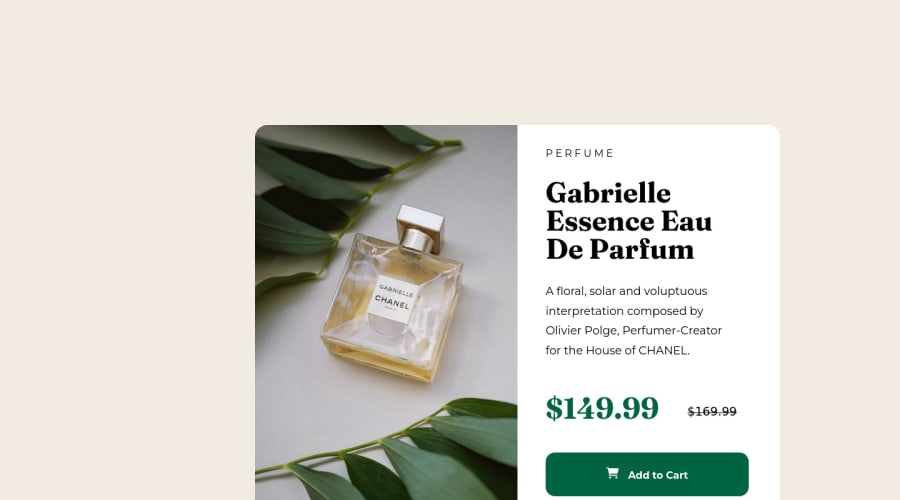
Not Found
Not Found
Not Found
Not Found
Not Found
Not Found
Not Found
Not Found
Not Found
Not Found
Not Found
Not Found
Not Found
Not Found
Not Found
Not Found
Not Found
Not Found
Not Found
Not Found

Submitted

Product Preview Page CSS/HTML Challenge - Perfume

Liz 80

@Azulio123

Desktop design screenshot for the Product preview card component coding challenge

This is a solution for...

  • HTML
  • CSS
1newbie
View challenge

Design comparison


SolutionDesign

Solution retrospective


I found getting used to the box model of CSS and HTML difficult. I found out that putting things in more div's gives you more power over the content. It is also quite easy to make styling convoluted, but I had fun inspecting in a browser and playing with individual values to get things "just right".

This project is by no means a carbon-copy, but it is pretty darn close! I learned A LOT along the way and it is my first challenge getting into coding and frontend development.

If anyone wish to look at my CSS in particular and let me know of any tips and tricks to tidy it up, I am totally open.

Community feedback

@MelvinAguilar

Posted

Hi @Azulio123 👋, good job completing this challenge, and welcome to the Frontend Mentor Community! 🎉

Here are some suggestions you might consider:

  • There are two modern CSS techniques to center elements instead of using margin property.

Using flexbox layout:

body {
   margin: 0;
   width: 100%;
   min-height: 100vh;
   display: flex;
   flex-direction: column;
   justify-content: center;
   align-items: center;
}

Using grid layout:

body {
   margin: 0;
   width: 100%;
   min-height: 100vh;
   display: grid;
   place-content: center;
}

Links with more information:

.

  • You could use the <del> tag to display the old price:
<del>
   <span class="sr-only">Old price: </span>$169.99
</del>

Note that I added the <span> with the sr-only class to the del element, this will provide more information about what your old price is about.

The sr-only class is a class that you can add to hide content visually but is only visible to screen-readers:

More information here.

I hope those tips will help you.

Good Job and happy coding !

Marked as helpful

2

Liz 80

@Azulio123

Posted

@MelvinAguilar Thanks for the great feedback! I actually need to clean up my css file because some of the classes and rules are superfluous. The margin rules in almost all of them are completely useless, so I still need to learn the proper dark art of centering content. This is certainly helpful. I have a lot of stuff to go through, but looking through the flexbox documentation, I think my life will be a lot easier going forward.

I am also intrigued by sr-only content and making things on the web accessible to more people. Definitely a good thing to consider!

All in all, another 10/10 piece of feedback. Thank you again and hopefully I will see your feedback again on my next challenge. :D

0
Lucas 👾 104,420

@correlucas

Posted

👾Hello Liz, Congratulations on completing this challenge!

Your solution its almost done and I’ve some tips to help you to improve it:

1.Add the website favicon inserting the svg image inside the <head>. <link rel="icon" type="image/x-icon" href="./images/favicon-32x32.png">

2.Use units as rem or em instead of px to improve your performance by resizing fonts between different screens and devices.

To save your time you can code your whole page using px and then in the end use a VsCode plugin called px to rem here's the link → https://marketplace.visualstudio.com/items?itemName=sainoba.px-to-rem to do the automatic conversion or use this website https://pixelsconverter.com/px-to-rem

3.Use the THE PICTURE TAG that is a shortcut to deal with the multiple images in this challenge. So you can use the <picture> tag instead of importing this as an <img> or using a div with background-image. Use it to place the images and make the change between mobile and desktop, instead of using a div or img and set the change in the css with display: none with the tag picture is more practical and easy. Note that for SEO / search engine reasons isn’t a better practice import this product image with CSS since this will make it harder to the image. Manage both images inside the <picture> tag and use the html to code to set when the images should change setting the device max-width depending of the device desktop + mobile.

Check the link for the official documentation for <picture> in W3 SCHOOLS: https://www.w3schools.com/tags/tag_picture.asp

See the example below:

<picture>
  <source media="(max-width:650px)" srcset="./images/image-product-mobile.jpg">
  <img src="./images/image-product-desktop.jpg" alt="Gabrielle Parfum" style="width:auto;">
</picture>

👨‍💻Here's my solution for this challenge if you wants to see how I build it: https://www.frontendmentor.io/solutions/product-preview-card-vanilla-css-and-custom-hover-state-on-hero-85A1JsueD1

✌️ I hope this helps you and happy coding!

Marked as helpful

1

Liz 80

@Azulio123

Posted

@correlucas This is unbelievably helpful! I already forgot in my bootcamp (I am doing challenges as extra work during that) that rem/em scale depending on the viewport. I like the plugin as well, because although I knew the size of each em in px, I still feel I have more control to write using px. That may change though as I become more accustomed to best practices.

I am learning about a lot more tags, so thanks for helping expand my knowledge and sharing great resources!

0

Please log in to post a comment

Log in with GitHub
Discord logo

Join our Discord community

Join thousands of Frontend Mentor community members taking the challenges, sharing resources, helping each other, and chatting about all things front-end!

Join our Discord