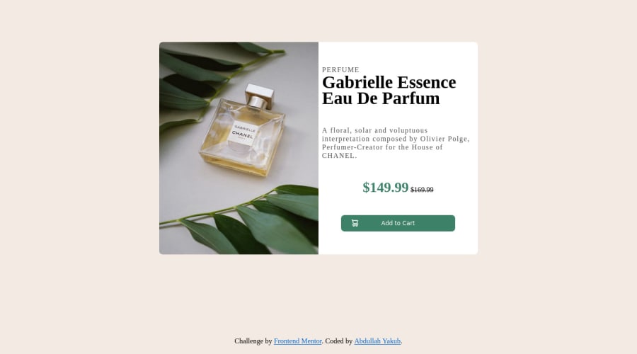
Not Found
Not Found
Not Found
Not Found
Not Found
Not Found
Not Found
Not Found
Not Found
Not Found
Not Found
Not Found
Not Found
Not Found
Not Found
Not Found
Not Found
Not Found
Not Found
Not Found

Submitted

Product preview page

@developerabz

Desktop design screenshot for the Product preview card component coding challenge

This is a solution for...

  • HTML
  • CSS
1newbie
View challenge

Design comparison


SolutionDesign

Solution retrospective


Not too sure if I did it the right way, was I meant to use html to switch the images and add alt tags or is putting it in css good enough? I don't exactly know how to get around putting alt text for background images. Any feedback is greatly appreciated.

Community feedback

@Miguelaeb

Posted

Hi @developerabz, congratulations on your solution!

Great solution and a great start! From what I saw you’re on the right track. I’ve a few suggestions for you that you can consider adding to your code:

Use a CSS reset to avoid all the problems you can have with the default CSS setup, removing all margins, and making the images easier to work, see the link below where you can download this file which contains the normalize.css: https://necolas.github.io/normalize.css/

Replace the <p> containing the main title with <h1> note that this title is the main heading for this page and every page needs one h1 to show which is the most important heading. Use the sequence h1 h2 h3 h4 h5 to show the hierarchy of your titles in the level of importance, never jump a level.

You should have put the CSS code in an external file, that is a better practice and would have made the code easier to manage.

To switch the images depending on the size of the web you can use the picture tag:

<picture> <source media="(min-width:650px)" srcset="img_pink_flowers.jpg"> <source media="(min-width:465px)" srcset="img_white_flower.jpg"> <img src="img_orange_flowers.jpg" alt="Flowers" style="width:auto;"> </picture>

I also recommend you to add a min-height of 100vh to the main container to centralize it and add some padding left to the texts so that you can move the texts away because they are very close

Add a margin of around margin: 20px to avoid the card touching the screen edges while it scales down.

Use relative units as rem or em instead of px to improve your performance by resizing fonts between different screens and devices. These units are better to make your website more accessible. REM does not just apply to font size, but to all sizes as well.

Here's my solution for this challenge if you want to see how I build it: https://www.frontendmentor.io/solutions/product-preview-card-component-MCflXO_TZz

I hope this helps you and happy coding!

Marked as helpful

1

@developerabz

Posted

@Miguelaeb Hi Miguel, Just wanted to say this is extremely helpful thank you so much. picture source was exactly what I was looking for. Your version is extremely stunning! Ill definitely be using it as a reference to fix things up :).

0

Please log in to post a comment

Log in with GitHub
Discord logo

Join our Discord community

Join thousands of Frontend Mentor community members taking the challenges, sharing resources, helping each other, and chatting about all things front-end!

Join our Discord