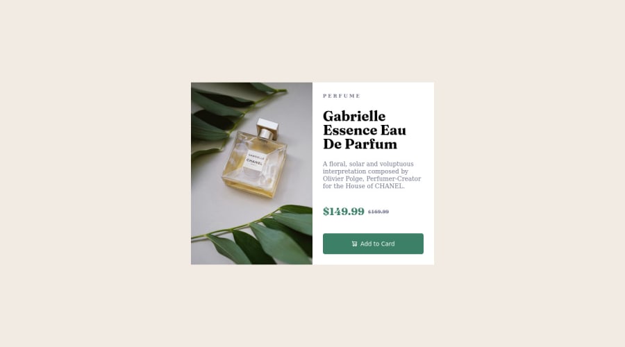
Design comparison
Solution retrospective
Any better way to layout the product info instead of a grid?
Community feedback
- @YabeshyjPosted almost 2 years ago
Hi @Scynes Your solution is really good 👍🏻
Tips to avoid warnings ⚠️ 1)Use at least 1 heading tag 2)Wrap all the content in the <main> tag so you can't get the landmark warnings 3) use alt attributes in img tags
1 - @SppamLitePosted almost 2 years ago
Hey Scynes👋 Nice job on completing this challenge!
I do think grid is harder than flex box but you did this challenge with grid, impressive! 👍
To answer your question:
Use flex box is easier to achieve the same layout as you did in grid.
Similar to what you did using
gridto.preview-card, you could dodisplay: flex,flex-direction: column;for mobile andflex-direction: row;for desktop. Instead of controlling the height with grid layout, you could adjust the actual.product-imageheight since you are using thebackground-image.I hope this could help 🙂.
Happy coding!
1
Please log in to post a comment
Log in with GitHubJoin our Discord community
Join thousands of Frontend Mentor community members taking the challenges, sharing resources, helping each other, and chatting about all things front-end!
Join our Discord
