Not Found
Not Found
Not Found
Not Found
Not Found
Not Found
Not Found
Not Found
Not Found
Not Found
Not Found
Not Found
Not Found
Not Found
Not Found
Not Found
Not Found
Not Found
Not Found
Not Found

Submitted

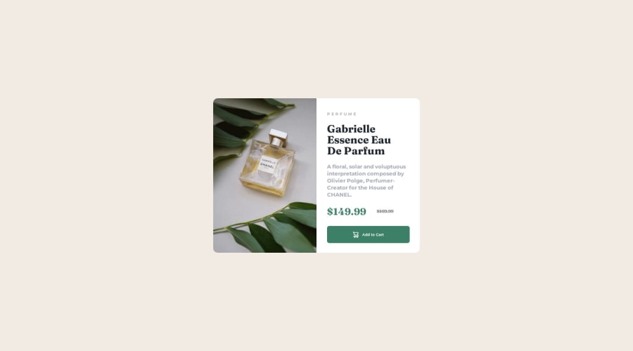
Product preview / Frontend Mentor challenge using HTML and CSS

cyrus K yegonβ€’ 60

@Kincyrus12

Desktop design screenshot for the Product preview card component coding challenge

This is a solution for...

  • HTML
  • CSS
1newbie
View challenge

Design comparison


SolutionDesign

Solution retrospective


Hey everyone i'll like any constructive feedbacks regarding this challenge, thank you!

Community feedback

Abdul Khaliq πŸš€β€’ 72,660

@0xabdulkhaliq

Posted

Hello there πŸ‘‹. Congratulations on successfully completing the challenge! πŸŽ‰

  • I have other recommendations regarding your code that I believe will be of great interest to you.

PiCTURE TAG πŸ“Έ:

  • Looks like you're currently using media queries for swapping different version of image, So let me introduce the picture element.
  • The <picture> tag is commonly used for responsive images, where different image sources are provided for different screen sizes and devices, and for art direction, where different images are used for different contexts or layouts.
  • Example:
<picture>
<source media="(max-width: 768px)" srcset="small-image.jpg">
<source media="(min-width: 769px)" srcset="large-image.jpg">
<img src="fallback-image.jpg" alt="Example image">
</picture>
  • In this example, the <picture> tag contains three child elements: two <source> elements and an <img> element. The <source> elements specifies different image sources and the conditions under which they should be used.
  • Using this approach allows you to provide different images for different screen sizes without relying on CSS, and it also helps to improve page load times by reducing the size of the images that are served to the user
  • If you have any questions or need further clarification, you can always check out my submission and/or feel free to reach out to me.

.

I hope you find this helpful πŸ˜„ Above all, the solution you submitted is great !

Happy coding!

1

cyrus K yegonβ€’ 60

@Kincyrus12

Posted

@0xAbdulKhalid thank you for taking time to view y code ad writing the feedback i appreciate you taking your time for this, this is helpful to me thank you.

0
Abdul Khaliq πŸš€β€’ 72,660

@0xabdulkhaliq

Posted

@Kincyrus12 Glad you found it helpful ! 🀠

0
PaweΕ‚ Pohlβ€’ 390

@Pawel1894

Posted

Hey,

I would suggest for you to start thinking about every project as it would be a big scalable project. This approach is going to improve your coding skills and make it more readable. s Css selectors like this:

container p 
or
section .picture1 img

are considered really bad practice in most cases and to maintain. Same with classes like .picture1 it does not really say much and isn't reusable. For start look up for some common css naming methodologies like BEM or Cube. Personally I find BEM really great for start and then moving to cube which is more focus on utility classes.

1

cyrus K yegonβ€’ 60

@Kincyrus12

Posted

@Pawel1894 thank you so much for taking time to go through my code i appreciate your feedback this just helped me go and learn more about naming classes. Thank you.

1

Please log in to post a comment

Log in with GitHub
Discord logo

Join our Discord community

Join thousands of Frontend Mentor community members taking the challenges, sharing resources, helping each other, and chatting about all things front-end!

Join our Discord