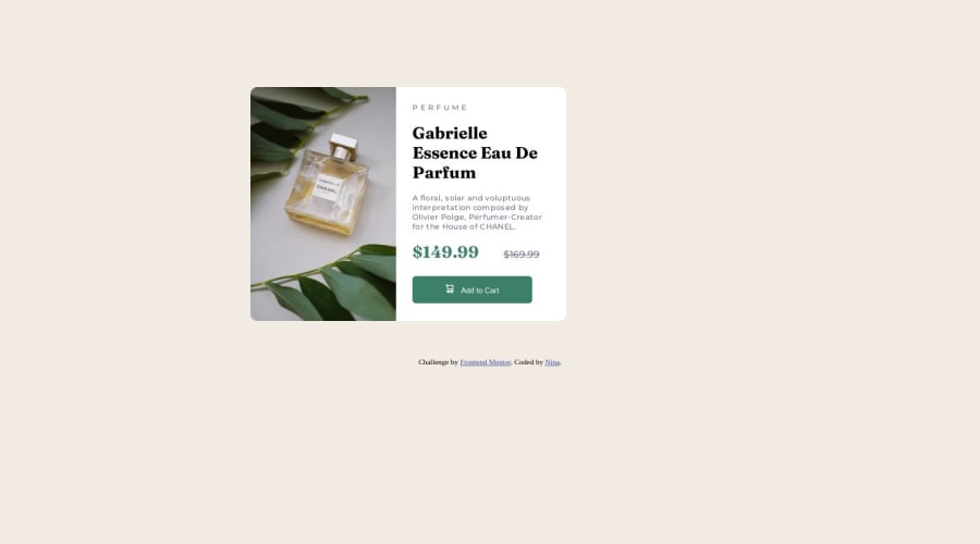
@itush
Posted
Congratulations on completing the challenge! π
-
To make it mobile responsive it is important to first understand how different breakpoints work with the media queries, which breakpoints to target etc.
-
Feel free to go through my product preview project code and notice how I handle responsiveness with mobile and desktop product images.
I hope this helpsπ€
Happy hackingππ»
Marked as helpful
@nina1234567896
Posted
@itush Thankyou. This is really helpful. I am having trouble deciding what breaking points to use when i use media queries.
@itush
Posted
@nina1234567896
You are most welcome!
We all improve with practice.
-
Designs only change at defined media query breakpoints. We have two options... either we can target a breakpoint apply some changes for that breakpoint and up screens or the same breakpoint and down screens.
-
For example, If you want to make the body blue @600px then you also need to decide whether the body remains blue on 600px and up screens or 600px and down screens. If you decide to maintain a blue background for 600px and up screens you'd use
@media only screen and (min-width: 600px) {...}
and@media only screen and (max-width: 600px) {...}
for the opposite scenario. And lets say @500px you want a red background and @700px you need a yellow background, then you need to follow the same drill. -
Please note: There are tons of screens and devices with different heights and widths, so it is hard to create an exact breakpoint for each device. To keep things simple we target the typical five groups of breakpoints. However, You can add as many breakpoints as you like to make it more responsive.
-
My CSS article that I've shared with you previously might also be helpful to understand the usage of media query.
-
Feel free to ask more questions!