Design comparison
SolutionDesign
Solution retrospective
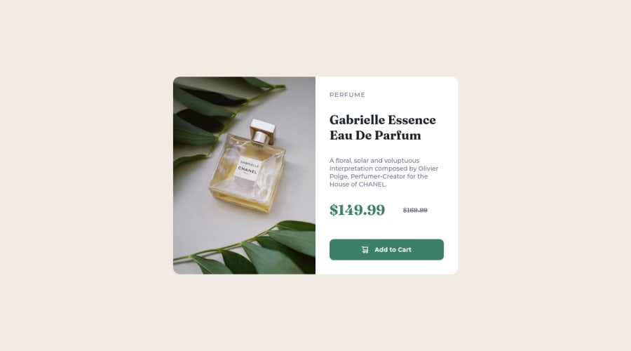
I had a hard time with the positionering of the image. It worked better as an image tag but then I had no clue how to change the source on the breakpoint.
Community feedback
- @CodingTimmyethPosted about 2 years ago
Hey! When you hover over Add to Cart, the cart disappears and the background-color is the wrong color. You should add the cursor:pointer element to your button. Besides that everything else looks good.
0
Please log in to post a comment
Log in with GitHubJoin our Discord community
Join thousands of Frontend Mentor community members taking the challenges, sharing resources, helping each other, and chatting about all things front-end!
Join our Discord
