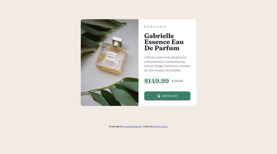
Design comparison
Solution retrospective
Largely happy but I have a niggling feeling my solution could have been simpler. I'm also still not confident using Aria roles and labelling.
I do have questions about best practice for accessibility, I'm aware this is a gap in my knowledge (amongst others).
Also, could I have solved the alignment of the prices without resorting to "flex"?
Community feedback
- @dusan-bPosted about 2 years ago
Hello Martin,
to improve the accessibility of your web page, I would consider some changes.
Alternative text for images
You should avoid using words like "image", "photography", "graphic" etc. for alternative text, because screen readers already do the job announcing images as images. In your case the image would read out as "Product image of Chanel perfume Gabrielle image". Something like "Chanel perfume Gabrielle" would be more appropriate.
Semantic HTML5
Generally, it's not recommended to use the "role" attribute. Especially when you can use the respective semantic elements instead. So, instead of
<div role="main">you should use "<main>". Also, specifying a role for a button is equally unnecessary, as a button element is already exposed with an implicit button role.ARIA attributes
The add-to-cart icon should be hidden for screen readers, because it has no additional meaning. You can do that by simply adding
aria-hidden="true"to the SVG. Just keep in mind to use ARIA attributes with caution, because the support for it varies among browsers and screen readers and is not as reliable as plain HTML solutions.Furthermore, I see that you have hidden the
divwith the classadvert-textby settingdisplay: none !important. Does this have a particular reason? By all means, using!importantis widely considered as a bad practice and will most likely cause specificity issues. Try to avoid that whenever possible.I hope this will help you to apply accessibility techniques with more confidence.
Keep up the good work!
Marked as helpful0@MCotonPosted about 2 years ago@dusan-b Hi, that's very complete and considered answer, thank you for taking the time to respond. I will be applying your advice from now on!
Can I ask though, where did you see the markup
display: none !important? It isn't in my stylesheet.0@dusan-bPosted about 2 years ago@MCoton Hi, I'm glad I could help. I have just noticed that my browser extension uBlock Origin is causing the container to be hidden. This is only because the class name contains the word "advert", wow. When I change the class name in dev tools, the content is displayed normally again. Interesting... I would maybe consider changing the class name to avoid excluding users like me from accessing the page content. :)
Marked as helpful0 - @lissajous-laserPosted about 2 years ago
Also, could I have solved the alignment of the prices without resorting to "flex"?
I don't think there is anything wrong with using flex. For instance, flex is great for centering even with only a single child element. But other ways to get the spacing are:
- Using
margin-righton the left price (conversely,margin-lefton the right price). - Setting the left price to
display: inline-blockand setwidthto be wide enough to cover the content and the spacing. - Setting the parent element of the prices to
display: gridand setting acolumn-gap.
0@MCotonPosted about 2 years ago@lissajous-laser Hey, thanks for your feedback. I'll look at implementing your suggestions in my next challenge.
1 - Using
Please log in to post a comment
Log in with GitHubJoin our Discord community
Join thousands of Frontend Mentor community members taking the challenges, sharing resources, helping each other, and chatting about all things front-end!
Join our Discord
