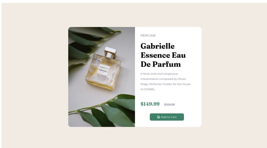
Design comparison
Solution retrospective
Are there any better ways of aligning image to the left so that i don't have to guess and set the left margin for the button? Should I keep the image tag out of the <main>?
Community feedback
- @elaineleungPosted about 2 years ago
Hi R. Raghav, first off, this is a great attempt in solving the challenge, so well done! About your question, yes, there definitely are better ways than using margins and float for positioning and centering.
What I suggest is that you use flexbox as a start, both for the body selector and also for the card. To do this, we'll first need to restructure the HTML so that the image and text can be separated under the card container. I'll also change a few things here, such as changing the button to
button
instead ofa
(because this is a submitting action and actions should use buttons, not link):<main class="card"> <div class="card-image"> <img src="images/image-product-desktop.jpg" alt="perfume.jpg" class="perfume-img"> </div> <div class="card-content"> <p class="title">PERFUME</p> <h1>Gabrielle Essence Eau De Parfum</h1> <p class="description">A floral, solar and voluptuous interpretation composed by Olivier Polge, Perfumer-Creator for the House of CHANEL.</p> <p class="discount-price">$149.99</p> <p class="original-price">$169.99</p> <button class="btn"> <img src="images/icon-cart.svg" alt="cart" class="cart-img"> <span>Add to Cart</span> </button> </div> </main>
After this, you can use flexbox and also remove all the margins and float. The CSS for the body and card looks like this:
* { box-sizing: border-box; margin: 0; padding: 0; } body { background-color: hsl(30, 38%, 92%); min-height: 100vh; display: flex; flex-direction: column; justify-content: center; } .wrapper { max-width: 600px; // everything else can be removed } .card { display: flex; text-align: left; background-color: hsl(0, 0%, 100%); border-radius: 18px; } .card-image { flex: 1 0 50%; // this uses flexbox's property for setting the width } .card-image img { width: 100%; height: 100%; object-fit: cover; border-radius: 15px 0 0 15px; } .card-content { padding: 1rem; flex: 1 1 50%; // this uses flexbox's property for setting the width } p { // remove padding-right } .title { // remove padding-top } h1 { // remove width; } .btn { padding: 10px; // remove width and margin-left }
Hope this can help you out, as I think in the long run, it would be much easier for you to learn how to use flexbox instead of trying to use margins for positioning!
Marked as helpful1@Ri-RaghavPosted about 2 years ago@elaineleung thanks a lot! i will look into flexbox and replace <a> with <button> . thanks for such a comprehensive answe
0 - @hyrongennikePosted about 2 years ago
Hi @Ri-Raghav,
Good first attempt on the challenge
You answer your question it comes down to how you structure your HTML, you need to break up the design into container to makes things easier for example on this challenge I see 3 main containers
main section section
now to add the element
main section img section p h1 p ....
if you look at the design like this writing the CSS will be easier. Below is a link to my solution for this challenge feel free to check it out.
Hope this helpful.
Marked as helpful0 - @correlucasPosted about 2 years ago
👾Hello R. Raghav, Congratulations on completing this challenge!
Nice solution and nice code! I can see that you paid a lot of attention to your code/design. If you don’t mind I’ve some tips for you: THE PICTURE TAG is a shortcut to deal with the multiple images in this challenge. So you can use the
<picture>
tag instead of importing this as an<img>
or using a div withbackground-image
. Use it to place the images and make the change between mobile and desktop, instead of using adiv
orimg
and set the change in the css withdisplay: none
with the tag picture is more practical and easy. Note that for SEO / search engine reasons isn’t a better practice import this product image with CSS since this will make it harder to the image. Manage both images inside the<picture>
tag and use the html to code to set when the images should change setting the devicemax-width
depending of the device desktop + mobile.Check the link for the official documentation for
<picture>
in W3 SCHOOLS:https://www.w3schools.com/tags/tag_picture.asp
✌️ I hope this helps you and happy coding!
1
Please log in to post a comment
Log in with GitHubJoin our Discord community
Join thousands of Frontend Mentor community members taking the challenges, sharing resources, helping each other, and chatting about all things front-end!
Join our Discord