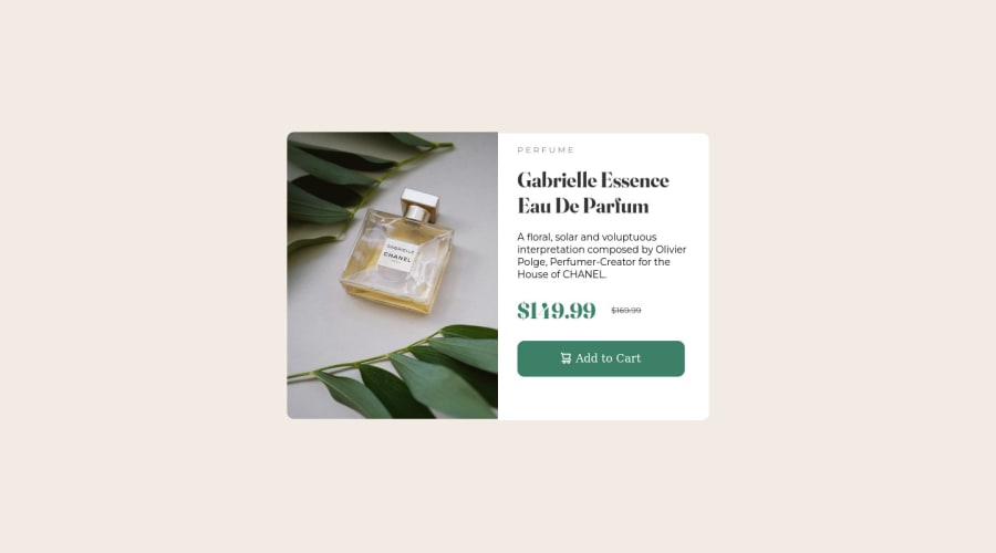
Design comparison
SolutionDesign
Solution retrospective
Q1. What did you find difficult while building the project? Ans. Understanding flexbox and media queries were a bit difficult for me.
Q2. Which areas of your code are you unsure of? Ans. Responsiveness.
Q3. Do you have any questions about best practices? Ans. As this is my first project, I don't know much about anything. Any suggestions of you will be helpful
Community feedback
- @cgrkzlknPosted over 2 years ago
Great job! I have several improvement suggestions:
- Image looks blurry in your page, you can fix it by adding
object-fit:cover;. Like this:
.main-fol .image { object-fit:cover; }- I see that you only use
image-product-desktop.jpg. It would be better switch toimage-product-mobile.jpgon mobile screens. You can do it like this:
<picture class="image-wrapper"> <source srcset="./images/image-product-mobile.jpg" media="(max-width: 475px)" /> <img src="./images/image-product-desktop.jpg" alt="Perfume"/> </picture>- You can use
letter-spacingCSS property for 'PERFUME' word.- Change
<p class="start">P E R F U M E</p>to<p class="start">PERFUME</p>And add this CSS:
- Change
.start{
   letter-spacing:4px;
}
Marked as helpful0@arbaaz99Posted over 2 years ago@cgrkzlkn Thanks for your help, I found it helpful, and keep helping me out with your grateful ideas
1 - Image looks blurry in your page, you can fix it by adding
Please log in to post a comment
Log in with GitHubJoin our Discord community
Join thousands of Frontend Mentor community members taking the challenges, sharing resources, helping each other, and chatting about all things front-end!
Join our Discord
