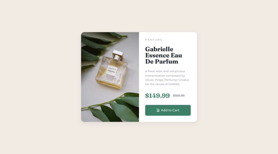
Product Preview Cards with Intrinsic Sizing


Design comparison

Solution retrospective
What I have learned from this challenge:
- Always use semantics!
- Customizing button
- Never use viewport units(they have conflict with browser zoom)
- Centering items using grid
- Intrinsic Sizing with padding and margin
My question to the community: I need more tips on developing more responsive website, any suggestions from you guys?
Update Turning these component into react reusable component that use tailwind and try to revision the component to make it look as similar as possible with the design(Update 3 Feb 24).
Community feedback
- @itushPosted almost 2 years ago
Congratulations on completing the challenge! 🎉
The desktop-view of your solution looks nice. But on mobile screens you may want to just fix two things to make it look even nicer.
-The footer flies up approximately in the middle.
-The main element does not have some top and bottom margin.
Feel free to checkout my project code and live site.
I always try to use relative CSS units because they scale better between different rendering mediums. And use absolute CSS units unless it's absolutely necessary. I haven’t faced any trouble with viewport units, so far so good 🤞😁
You may checkout my article on 12 Important CSS topics and find some tips on developing more responsive website
Once again you have done a wonderful job.
And I look forward to see cool projects from you in the future🚀
Keep at it...💻 Happy hacking!
Marked as helpful0 - @0xabdulkhaliqPosted almost 2 years ago
Hello there 👋. Congratulations on successfully completing the challenge! 🎉
- I have other recommendations regarding your code that I believe will be of great interest to you.
PiCTURE TAG 📸:
- Looks like you're currently using media queries for swapping different version of
image, So let me introduce thepictureelement.
- The
<picture>tag is commonly used for responsive images, where different image sources are provided for different screen sizes and devices, and for art direction, where different images are used for different contexts or layouts.
- Example:
<picture>
<source media="(max-width: 768px)" srcset="small-image.jpg">
<source media="(min-width: 769px)" srcset="large-image.jpg">
<img src="fallback-image.jpg" alt="Example image">
</picture>
- In this example, the
<picture>tag contains three child elements: two<source>elements and an<img>element. The<source>elements specifies different image sources and the conditions under which they should be used.
- Using this approach allows you to provide different images for different screen sizes without relying on CSS, and it also helps to improve page load times by reducing the size of the images that are served to the user
- If you have any questions or need further clarification, you can always check out
my submissionand/or feel free to reach out to me.
.
I hope you find this helpful 😄 Above all, the solution you submitted is great !
Happy coding!
2


Please log in to post a comment
Log in with GitHub
Join our Discord community
Join thousands of Frontend Mentor community members taking the challenges, sharing resources, helping each other, and chatting about all things front-end!
Join our Discord