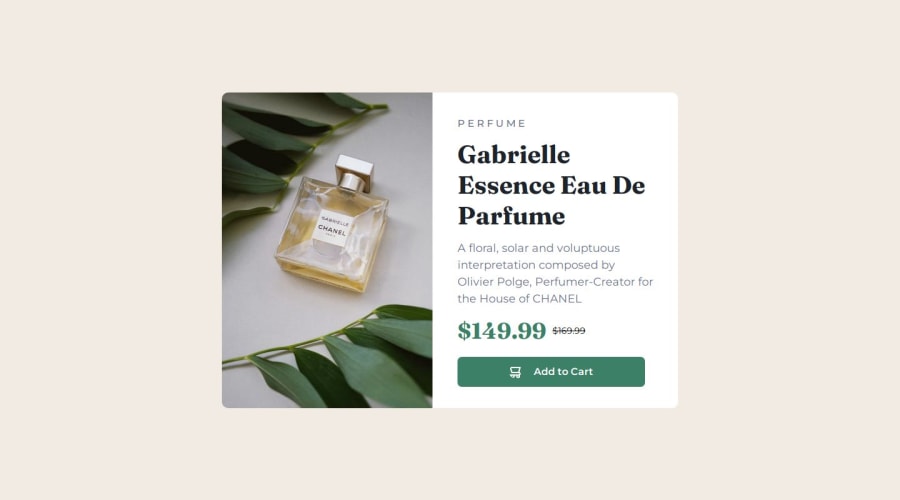
Product preview card with responsive page
Design comparison
Solution retrospective
I added overflow hidden for but when i'm to mobile view, the button itsn't appear. so frustrating
Community feedback
- @abhi-zeroPosted 11 days ago
Hey, your preview looks good, but there are some minor issues. Here are a few suggestions:
HTML:
Image Tags: I noticed you used two
<img>
tags in your HTML. While this isn't wrong, if your project requires changing images based on screen size, it's best practice to use the<picture>
tag instead. (You can search for "picture tag" on YouTube or Google for more information.)Heading Spacing: For your
h3
heading ("Perfume"), I see you've added spaces using the keyboard. This isn’t a good practice. I recommend using the CSS propertyletter-spacing
for proper spacing.CSS:
Card Sizing: For projects like this that involve creating cards, I suggest using
min-width
andmax-width
properties to ensure the card sizes stay within those limits.Mobile Version: In the mobile version, only the top corners are rounded, but in your solution, only the right-side corners are rounded. You should apply the
border-radius
property for both desktop and mobile versions with different values.General Suggestions:
Separate CSS Files: It's a good practice to use a separate file for CSS and place it in its own folder (e.g., folder:
styles > file: css/style.css
). This makes it easier for others to access and read your solution.Font Hosting: Consider hosting your own fonts instead of relying heavily on Google Fonts. You can search for "
@font-face
" to learn how to do this.If you need any help, just let me know. If you want sources, you can find them on the MDN Web Docs or on YouTube. If you can't find what you're looking for, feel free to ask any mentor on this site; they are really good people. You can also directly ask me!
Good luck with your future projects!
0 - @SoulOfMoPosted 11 days ago
I don't understand what you meant by the button not showing. I've noticed that in the mobile view, there's no space between the container and the body, which makes the layout look cramped. To resolve this, you can add some padding to the top and bottom of the container. This will create more breathing room and improve the overall appearance.
0
Please log in to post a comment
Log in with GitHubJoin our Discord community
Join thousands of Frontend Mentor community members taking the challenges, sharing resources, helping each other, and chatting about all things front-end!
Join our Discord